To design custom aprons step by step: pick the style for the wearer's role, choose a strong strap and a fabric with enough weight, decide between embroidery and a leather label, build the branding into the apron with colour panels or custom straps, match your brand colours, proof the design in a mockup, then order with enough volume and lead time. Design from the job, not the catalogue, and keep the decoration premium so a cheap finish never undermines a solid apron.
There is no single best apron, so designing one is a series of clear decisions rather than a guess. Work through the steps below in order and you will land on an apron that fits the brand, the role and the budget. You can build it as you read using the free apron mockup generator.
The walkthrough
1. Pick the style by role
Start from what the wearer actually does, not the catalogue. A bib apron gives chefs full coverage. A waist or bistro apron gives servers and bartenders mobility and front pockets. A barista apron suits coffee bars and demos. A denim or leather-look apron suits craft, BBQ and gifting. Choose the silhouette that fits the role first, then design on top of it.
2. Choose strap and fabric
This is where quality is won or lost. Straps are the clearest quality tell: thin weak strings feel cheap, while thick, solid, comfortable straps signal a premium apron that survives daily tying and frequent washing. The fabric needs enough weight and structure to feel protective, not flimsy. Denim is strong and full of character; recycled PU leather gives a premium leather look without traditional leather. Pick for durability first, because the apron will be washed hot and often.
3. Decide embroidery vs leather label
Aprons face food, drinks, stains and frequent hot washing, so the decoration has to survive demanding conditions. Embroidery is the durable, professional default that holds up to washing across most fabrics. A leather or leather-look label is the premium craft finish, especially on denim, BBQ, barista and gifting aprons. Printing can work, but only when the quality is genuinely good, because a cheap print kills an otherwise solid apron.
4. Build branding into the apron
The strongest single placement is a clean logo at the centre of the chest. The best designs go further and build branding into the apron itself: contrast-colour pockets, pockets in your company colours, custom straps, a different fabric panel, or a leather patch. A branded palette plus a clean chest logo reads as designed, not as a logo slapped onto a generic blank.
5. Match your brand colours
Pin down the exact colours before you proof. Map your logo and panel colours to specific references so the factory matches them, and check how the design reads against the apron fabric. A coffee brand with cream straps on a forest-green apron, or a producer with a single branded pocket, only works when the colours are deliberate. This is also where you confirm the design holds up at a glance from across a room.
6. Proof the design
Preview the apron in a mockup before committing. Drop in your logo, set your colours and decoration, and check the placement, scale and finish. Compare a chest logo against a colour-panel build, and embroidery against a leather label, so you order the version that actually looks best rather than the first idea. Then sign off on a clear proof.
7. Order with volume and lead time
Quantity and lead time are the two biggest price levers. Aprons get materially cheaper per unit at volume, and ordering early unlocks more efficient production and a lower unit price than a rush job. Plan ahead, order enough volume, and avoid rush production. Exact MOQ, lead time and price depend on the model, material, decoration and quantity, so design your apron to see live pricing rather than guessing.
Map the logo placement, the panel colours and the decoration before you proof. Designing from the role and the brand colours is what keeps the final apron looking deliberate.
Embroidery vs leather label, side by side
The decoration choice shapes both the look and the cost, so it is worth seeing the trade-offs in one place before you proof.
| Decoration | Durability | Look | Best for |
|---|---|---|---|
| Embroidery | Excellent, survives hot wash | Professional, tactile, on-brand | Hospitality uniforms, most fabrics |
| Leather / leather-look label | Excellent, premium feel | Craft, high-value, gift-grade | Denim, BBQ, barista, gifting |
| Variable, execution-critical | Good only when quality is high | Large flat artwork, lower budgets |
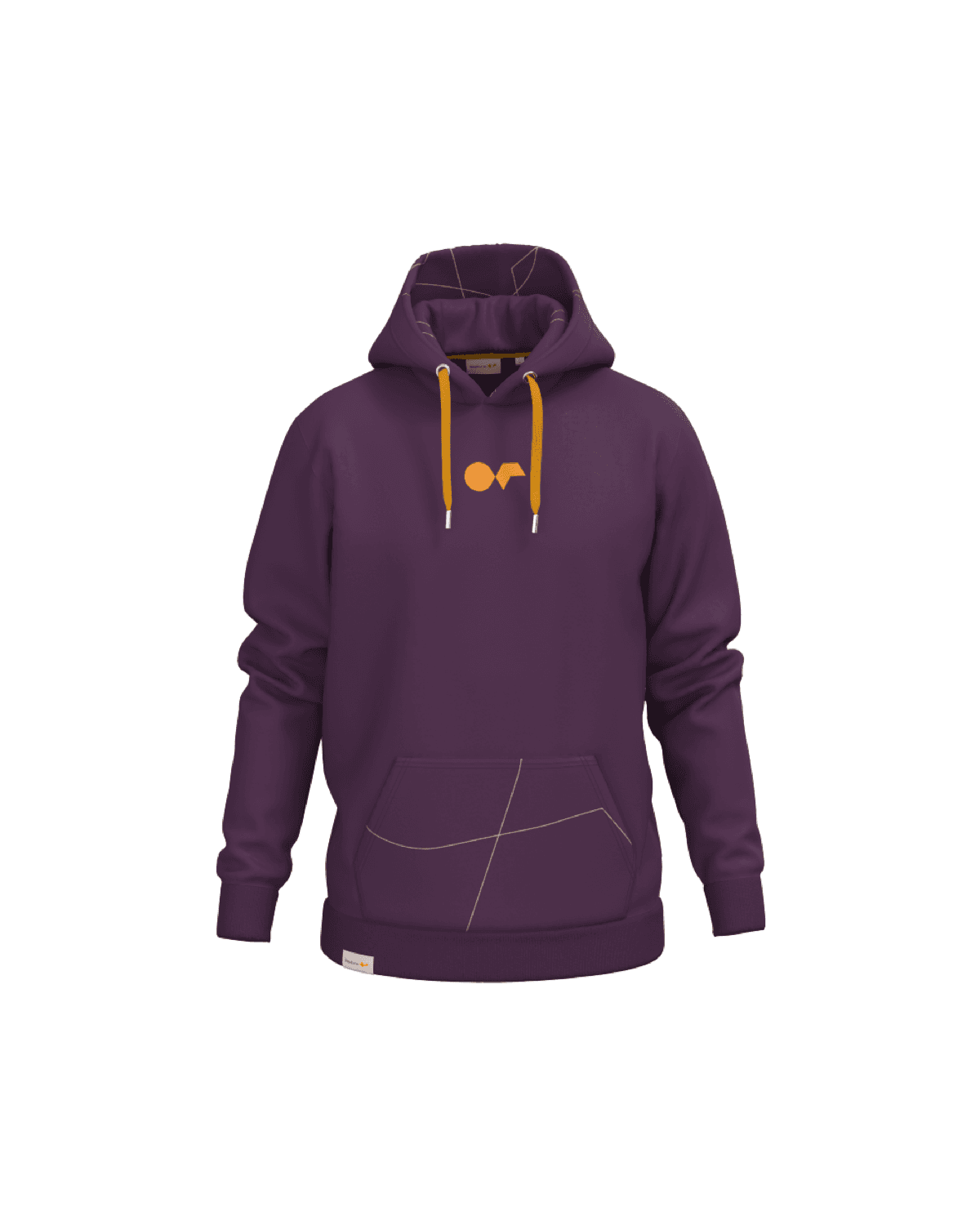
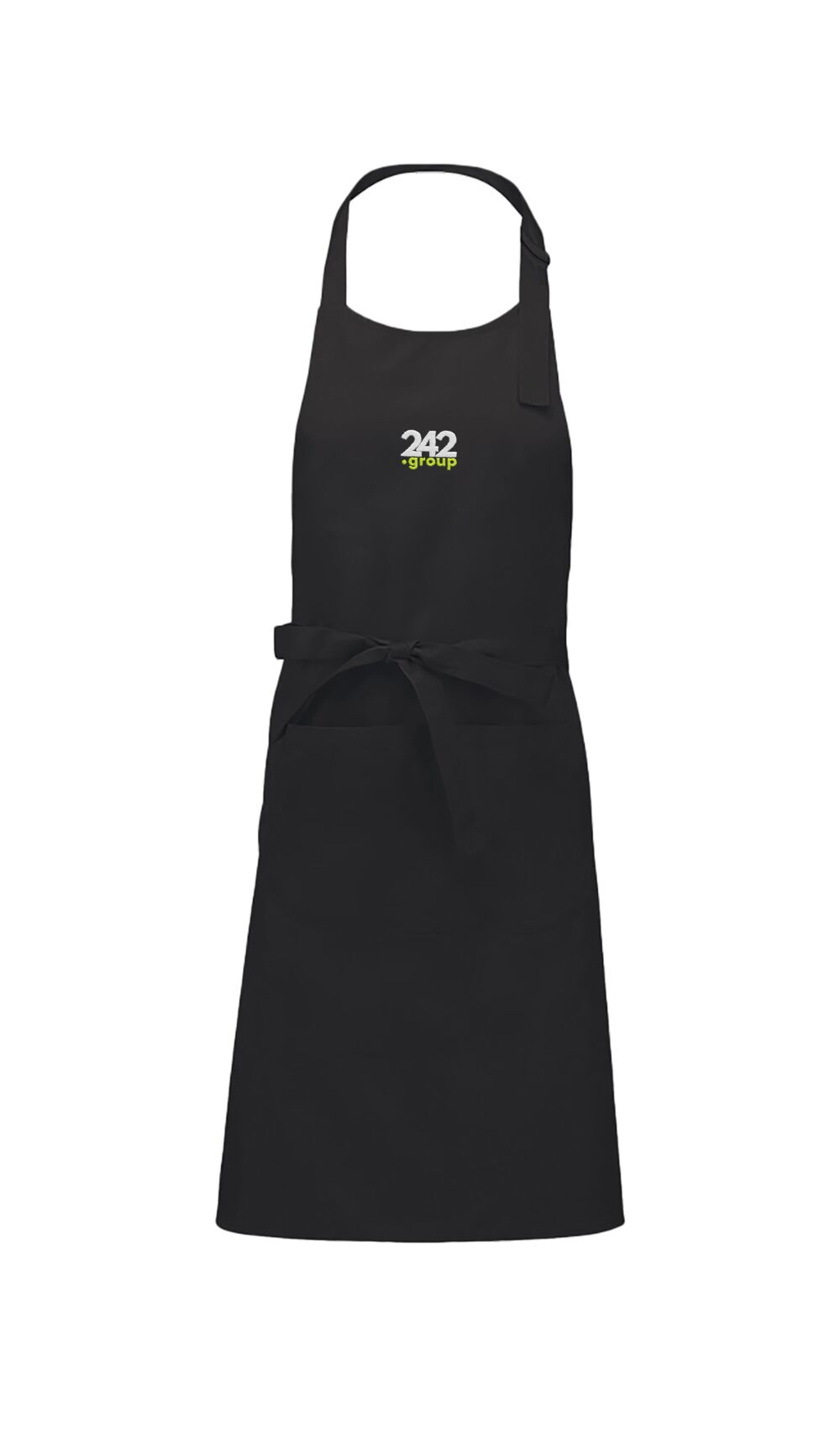
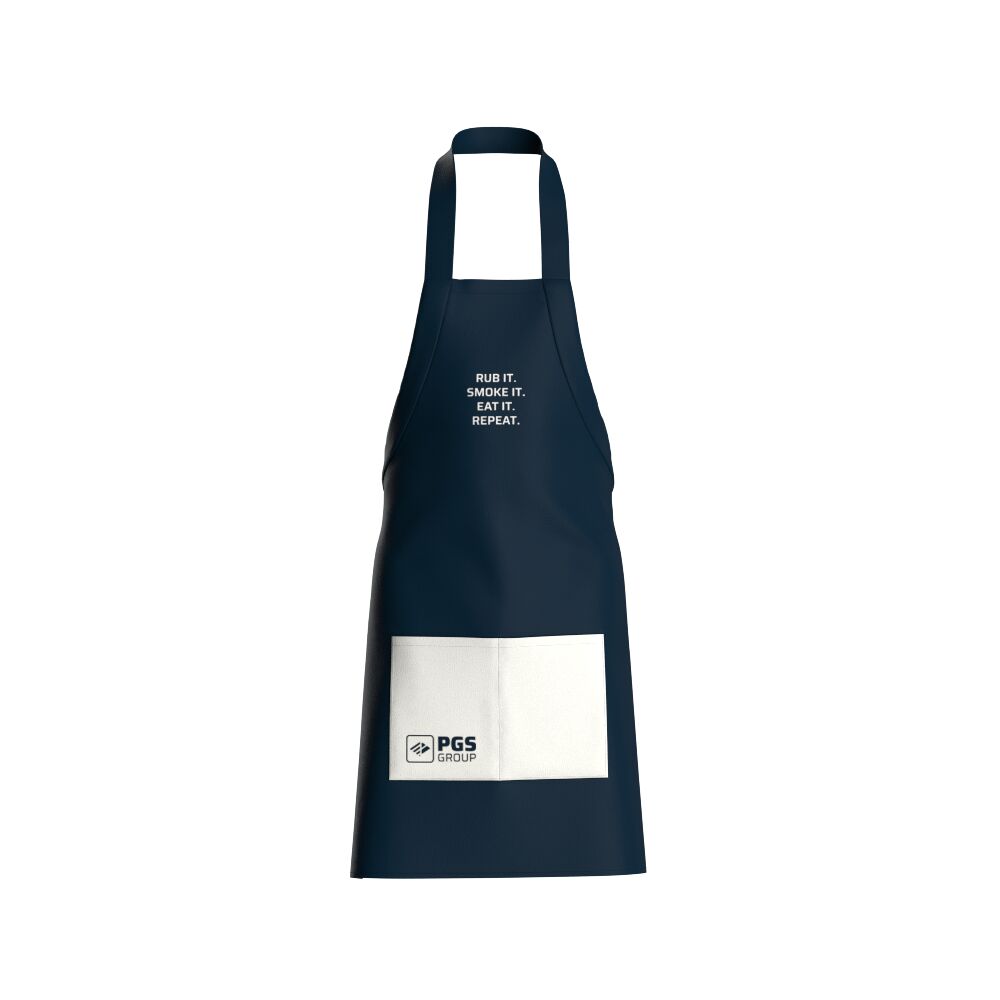
A proof with the logo placed and colours set. Sign off on a clear version like this before production, so what you order is what arrives.
Designing for a uniform vs a gift
The design approach barely changes between a uniform and a gift. In both cases the apron should look good, fit the brand, use durable materials, tolerate frequent washing, and carry strong decoration. The difference is presentation. A gifting apron may add premium packaging, a personalised card, more luxurious materials or a stronger campaign story. Design the apron the same way; change the wrapping. Browse the full range in the catalog or see how production works in how it works.
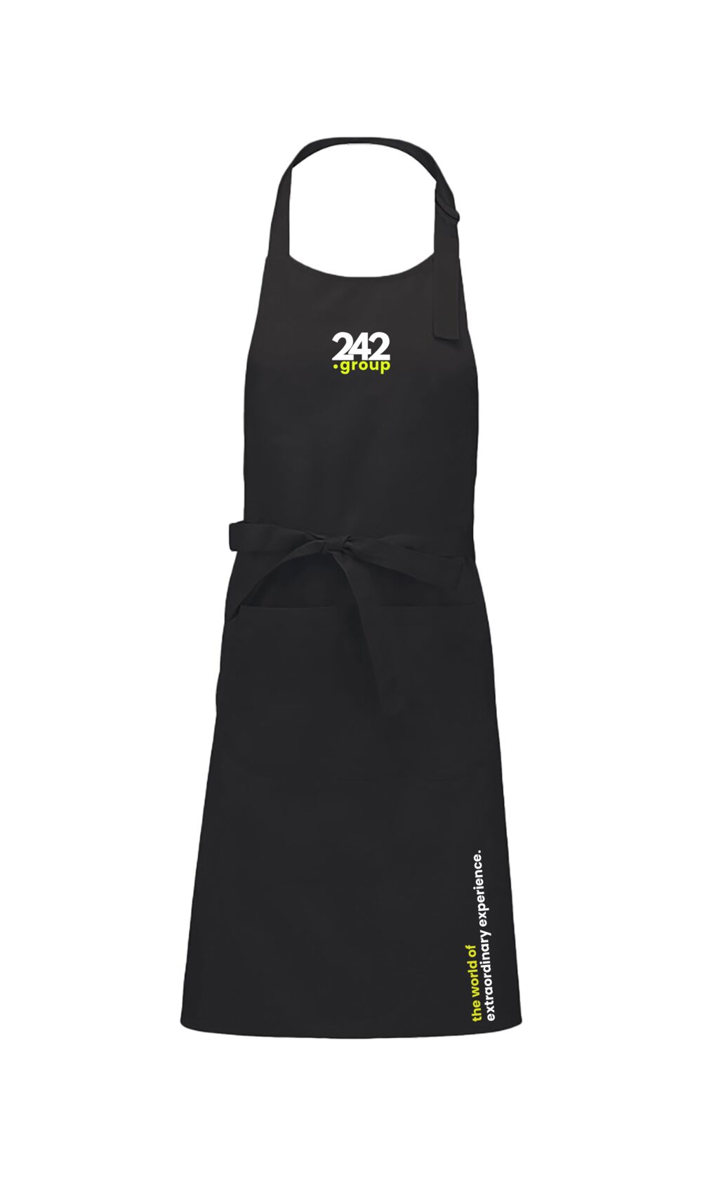
The finished mockup, ready to order. From style to strap to decoration to colour, every decision is visible and signed off.
Keep reading: custom aprons
Design your apron in 30 seconds
Run the seven steps live: pick a style, choose your strap and fabric, add embroidery or a leather label, set your colours, and see a real mockup with live pricing.
Get free designs