

The custom apron design examples that work share four moves: a clean logo at the centre of the chest, branding built into the apron with colour-panel pockets or custom straps, a durable finish like embroidery or a leather label, and a clear connection between the apron and the brand. The strongest designs look designed, not like a logo dropped onto a generic blank. Match the apron to the activity, keep the decoration premium, and it reads as a real branded product.
An apron is only ever as good as its relevance. When it fits the brand, the audience and the activity, it is one of the most distinctive products in a campaign. The examples below are organised by the design decision behind them, so you can lift the principle and apply it to your own apron in the free apron mockup generator.
1. Centre-chest branding: the clean default
The strongest single placement on any apron is the centre of the chest. It is visible, clean and instantly recognisable across a room, which is exactly what you want when a crew is working a bar, a kitchen or a demo station. A drinks brand that puts a crisp logo at chest height, embroidered in a single contrast colour, gets a design that photographs well and reads as a uniform people are proud to wear.
The rule is restraint. One logo, placed once, executed cleanly beats a busy apron covered in text. If you only do one thing, get the chest logo right and stop there.
2. Colour panels and custom pockets
The best branded aprons go a step further and build the branding into the apron itself. Contrast-colour pockets, pockets in your company colours, custom straps, a different fabric panel: these turn a blank into a designed product. A coffee brand with cream straps on a forest-green apron, or a food producer with a single branded pocket, reads as deliberate. A branded palette plus a clean chest logo is the formula that looks designed rather than slapped together.
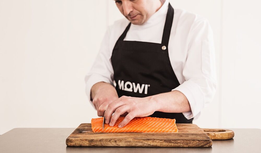
A branded apron worn in a real food environment. The chest logo and the premium build do the work. The apron looks like part of the brand, not a giveaway.
3. Leather labels on denim
Decoration hugely affects perceived quality. The same apron can read as cheap or premium depending purely on the finish. A leather or leather-look label on a denim apron is the single most premium move available, and it suits craft venues, BBQ campaigns, barista bars and gifting. Denim has character, wears well over time, and gives a leather label a strong base to sit on.
Embroidery is the durable, professional default that survives frequent hot washing across most fabrics. A leather label adds the craft finish on top. What you want to avoid is a cheap print, which undermines an otherwise solid apron.
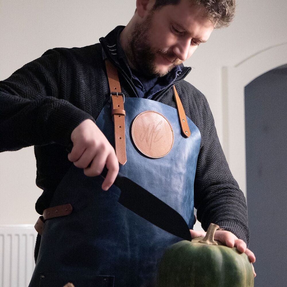
A premium leather apron. This is the finish that turns an apron into a genuine gift for someone into cooking, BBQ or craft, rather than a staff-only garment.
4. Wiese Oktoberfest crew aprons
Wiese, a beer brand, produced custom aprons for an Oktoberfest activation, worn by the full crew and matched to the theme. The design worked because it connected four things at once: the beer category, the hospitality environment, the cultural setting and the team's role. The apron was part of the event experience, not a random giveaway.
The design lesson is connection. When the apron, the brand, the setting and the people all line up, the apron stops being merch and becomes part of the moment. A themed crew apron pulls the whole activation together and travels through every photo of the event.
5. Premium leather gifting aprons
Sunday also produced premium leather gifting aprons for a gifting campaign. They are proof that aprons are not only uniforms. A well-made leather apron becomes a high-value gift for people into cooking, BBQ, craft or food culture: a Father's Day gift for a whiskey brand, a BBQ gift for a food producer, a thank-you for a premium hospitality partner.
The design approach barely changes from a uniform. The apron still needs durable materials, strong decoration and washability. The difference is presentation: premium packaging, a personalised card, more luxurious materials, a stronger campaign story. That packaging layer is what turns a great apron into a great gift.
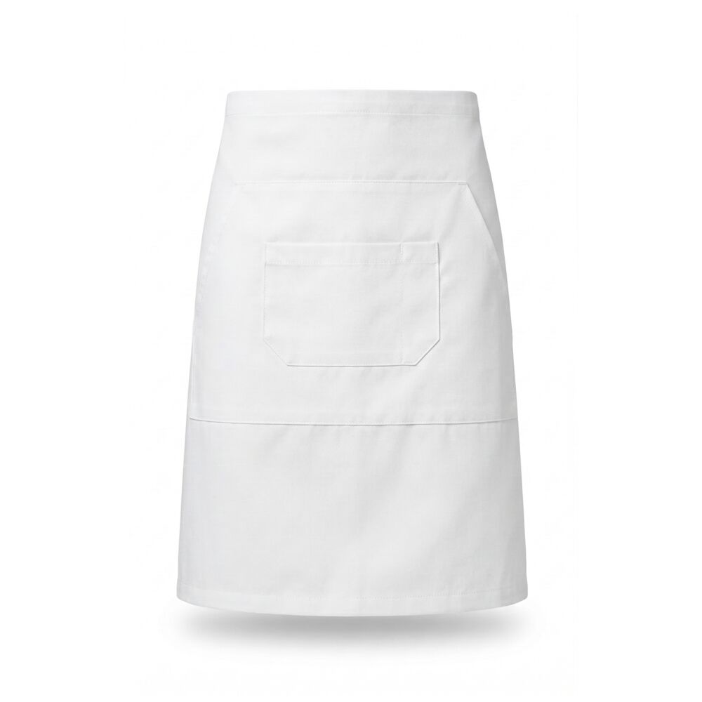
A clean half-apron silhouette. Versatile across servers, bars and gifting, and a simple canvas for a chest logo or a leather label.
6. Barista and bistro builds
Different roles need different aprons, and the design follows the job. A barista apron with front pockets and a clean counter-facing look suits coffee bars and demos. A waist or bistro apron gives servers and bartenders mobility and pockets for pads, openers and cards. A bib apron gives chefs full coverage. The design example here is simple: pick the silhouette for the role first, then brand it, rather than forcing one apron onto every job.
| Apron style | Design move that works | Best for |
|---|---|---|
| Denim apron | Leather label + contrast straps | Craft, BBQ, premium hospitality, gifting |
| Barista apron | Clean chest logo + branded pockets | Coffee bars, tastings, demos |
| Bistro / waist apron | Colour-panel pocket in brand colour | Servers, bars, cafes |
| Bib apron | Embroidered logo, durable for hot wash | Kitchens, chefs, food prep |
| Leather / leather-look | Premium finish + gift packaging | Father's Day, BBQ and food gifting |
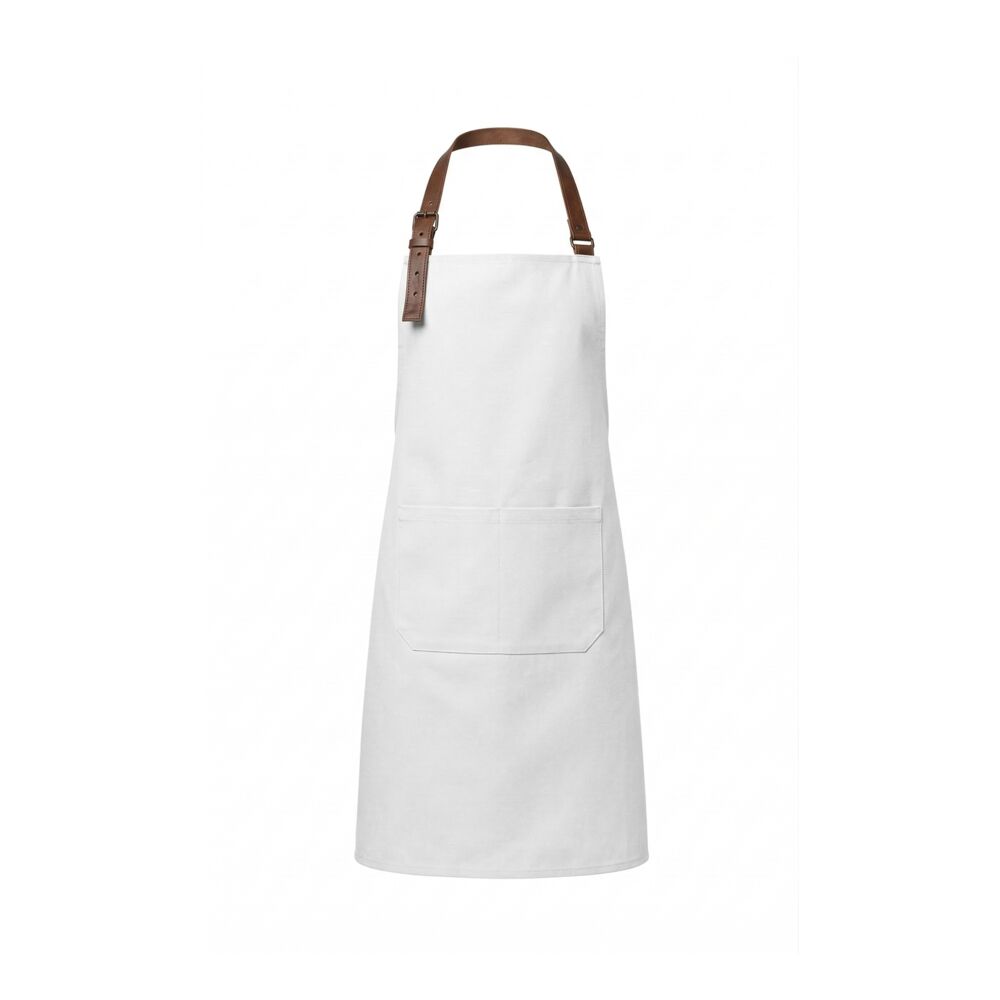
A heritage silhouette. The kind of apron that takes a leather label beautifully and lands as a premium gift or a craft-venue uniform.
7. What makes an apron design fail
The designs that fail share one trait: no logical relationship to the recipient or the campaign. An apron handed out at an event with no connection to cooking, serving, making or hospitality lands flat. So does a solid apron ruined by a cheap print, or a busy design that buries the brand under too much text.
- Keep the branding clean. One clear logo at the chest beats clutter every time.
- Skip cheap print. Use embroidery or a leather label so the finish matches the garment.
- Match the apron to the activity. Relevance is what separates a great apron from a forgettable one.
- Build branding into the apron with colour panels and custom straps, not just a logo on a blank.
Custom apron design examples: questions answered
What makes a good custom apron design?
A good custom apron design uses a clean logo at the centre of the chest, builds branding into the apron itself with colour-panel pockets or custom straps, and finishes with a durable decoration like embroidery or a leather label rather than a cheap print. The strongest designs also connect the apron to the brand, the audience and the activity, so it reads as a deliberate branded product rather than a logo dropped onto a generic blank.
Where should the logo go on a branded apron?
The strongest single placement is the centre of the chest. It is visible, clean and recognisable across a room, which matters when a crew is working a bar, kitchen or demo. For a more designed look, pair the chest logo with branding built into the apron: contrast-colour pockets, pockets in your company colours, custom straps or a different fabric panel. A branded palette plus a clean chest logo is the formula that looks designed.
Should I use embroidery, print or a leather label?
Embroidery is the durable, professional default that survives frequent hot washing across most fabrics. A leather or leather-look label is the premium option, especially on denim, BBQ, barista and gifting aprons. Printing can work but execution is critical, because a cheap print undermines an otherwise solid apron. For most branded aprons, embroidery for the logo and a leather label for the premium finish is the combination that works.
What are real examples of branded aprons that worked?
Two stand out. Wiese, a beer brand, made custom Oktoberfest crew aprons matched to the theme and worn by the full crew, which worked because it connected the beer category, the hospitality setting and the team's role. Sunday also produced premium leather gifting aprons that became high-value gifts for people into cooking, BBQ and craft, proving aprons are not only uniforms.
Can a custom apron be a premium gift?
Yes. A well-designed apron is a genuinely premium gift, not a staff-only garment. It can be a Father's Day gift for a whiskey brand, a BBQ gift for a food producer, or a thank-you for a premium hospitality partner. The design approach barely changes from a uniform, since it still needs durable materials, strong decoration and washability. The difference is presentation: premium packaging, a personalised card and more luxurious materials.
How do I preview my apron design before ordering?
Use the free apron mockup generator to drop in your logo, choose your colours and decoration, and see a realistic preview before you commit. You can compare a chest logo against a colour-panel build, test embroidery versus a leather label, and check how the design reads at a glance. Once it looks right, the same flow gives you live pricing and lets you order in 30 seconds.
Keep reading: custom aprons
Design your apron in 30 seconds
Pick a style, drop in your logo, choose embroidery or a leather label, and see a real mockup with live pricing. Bulk and event distribution built in.
Get free designs

