What are Pantone colors?
Pantone colors are the universal language of color in manufacturing and design. The Pantone Matching System (PMS) assigns unique codes to over 2,100 standardized colors, enabling manufacturers worldwide to reproduce exact shades. In branded merchandise production, Pantone matching ensures brand colors appear identically across apparel, accessories, and packaging - critical for brand consistency at scale.
The basic elements of a good branding are: a catchy name, a recognizable logo, a clear typography, popping colors, and easy access to download brand assets. A brand’s color is critical to its identity, and staying updated with the color of the year can enhance its relevance, while using a color swatch can help keep these colors consistent, which presents multiple challenges that can be solved through Pantone color systems.
Learn more about the meaning of Pantone colors and how to use them in textiles.
What we will discuss in this ultimate Pantone guide:
- What is the meaning of pantone?
- The difference between RGB, CMYK and PMS colors.
- The difference between spot colors and process colors.
- The difference between offset litho printing, digital printing and screen printing.
- Why is Pantone important for textiles?
What is the meaning of Pantone?
Let’s start with the definition of Pantone
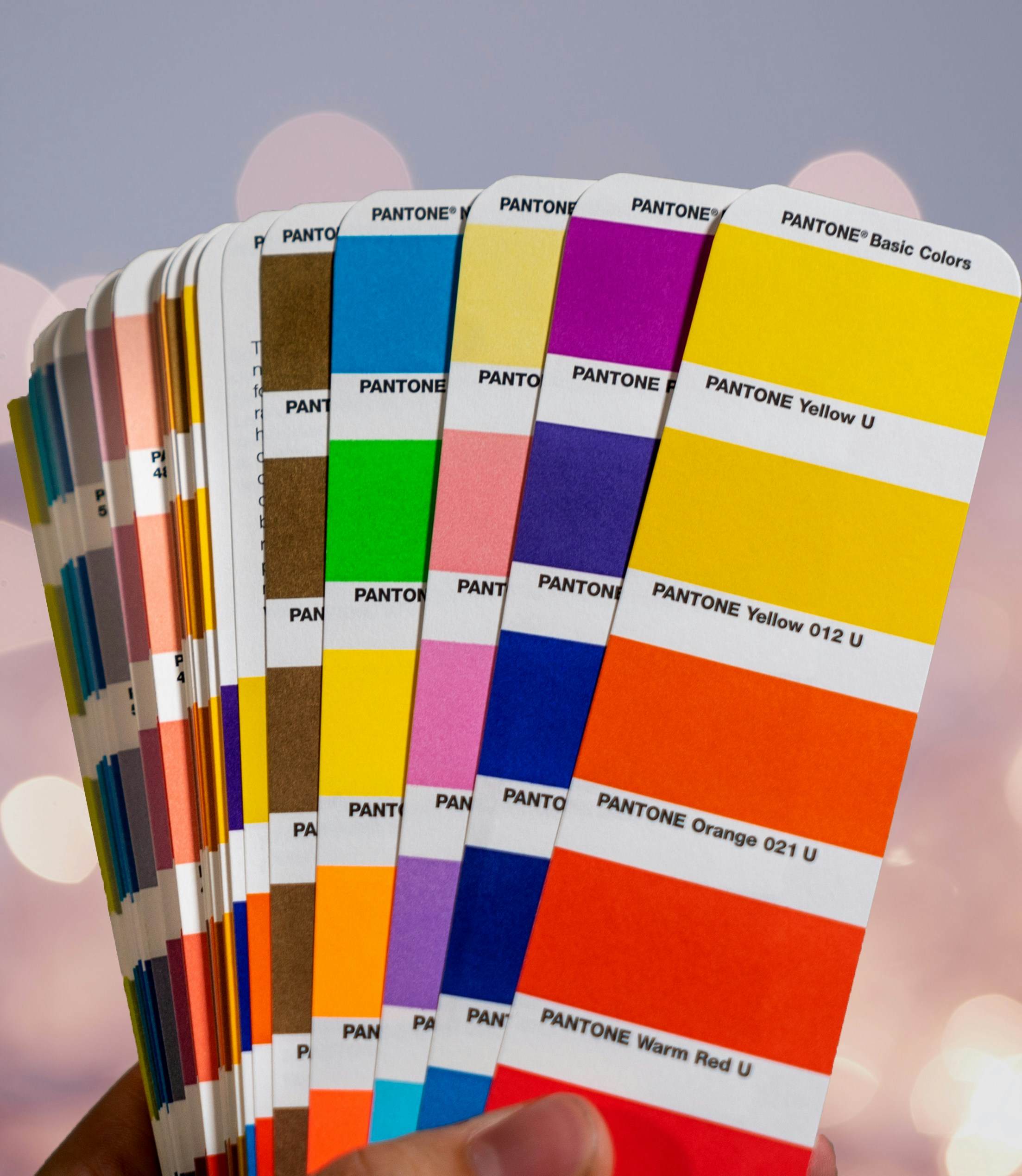
Pantone colors are different color codes that stand for specific shades. They are defined by a formula. The formula developed by Pantone results in a spot color. This means that the color is created from a palette of 18 basic colors. You can communicate about colors by defining the Pantone code. Basically it is the standard language for colors and we are likely to use it as a reference.
Pantone colors in Branded Merchandise
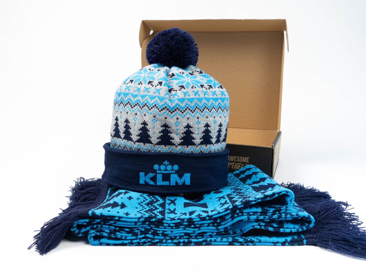
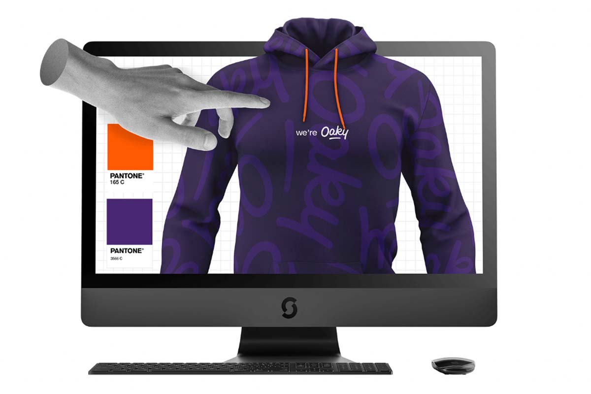
As a merchandise platform producing custom products for 4,000+ brands, Sunday uses Pantone color matching on every order to guarantee brand accuracy. Even a 5% color deviation can make branded apparel look “off-brand” - especially when placed next to digital brand assets. Pantone-matched merchandise ensures your hoodie’s shade of blue is identical to your website, business cards, and office signage.
Why is Pantone created?
If Pantone colors are provided, every involved party knows exactly what the end product should look like. Therefore they developed a system for objectively identifying colors. This allows everyone to guarantee the match between the desired color and the ink color, which can differ if you don’t use PMS color.
The first Pantone guide from 1963 contained ten colors and was the basis for a universal color language. Thanks to the Pantone Color Matching System, printers, designers and marketers around the world know to use Pantone 802 C, for our perfect Sunday Green.
The difference between RGB, CMYK and PMS colors
Colors are an important aspect of printing, but not all colors are the same. There are different color models (types of colors). The most important color models are RGB, CMYK and PMS.
RGB
RGB colors (Red Green Blue) mainly occur in digital media. Think of your monitor, tv or the pictures you make with a digital camera.
With RGB, the starting point is ‘light’. The more light that is produced, the more color that can be seen. Without any light, there is no noticeable color, also known as black. The easiest example is your monitor.
- If it doesn’t produce any light, the only thing you see is black.
- The more light your monitor produces, the brighter the colors will be.
- If the monitor produces Red, Green and Blue at their maximum levels and they are mixed together, you’ll see white.
The color consists of a combination of the three (Red, Green, Blue) base colors. The amount of each color is between 00 (none of that color) and 255 (all of the color). In total, you can create 16.777.216 colors.
RGB colors can’t be printed since paper doesn’t produce any light. Paper absorbs and reflects light that is emitted by another light source such as the sun, your desk lamp or your monitor. In order to print RGB colors we must convert the additive color model (RGB) to a subtractive color model (CMYK).
CYMK
CMYK colors are composed of four base colors: Cyan, Magenta, Yellow and Key (Black). Just like RGB, different colors are formed by combining these four base colors.
The first difference is the surface/background. With CMYK it’s white (e.g. the paper). This is why we need the “Key” color to make a beautiful, deep black.
In addition, paper absorbs and reflects light as opposed to a monitor that emits light. Because of this, we use inks that partially absorb the light. Only the unabsorbed light is reflected. This means that the hue of the paper itself is also a very important factor in the way colors are perceived.
CMYK colors don’t just absorb the light that is reflected by the paper, but they are also influenced by the color of the paper. An identical picture printed on white paper will be perceived differently than one printed on recycled or salmon-colored paper.
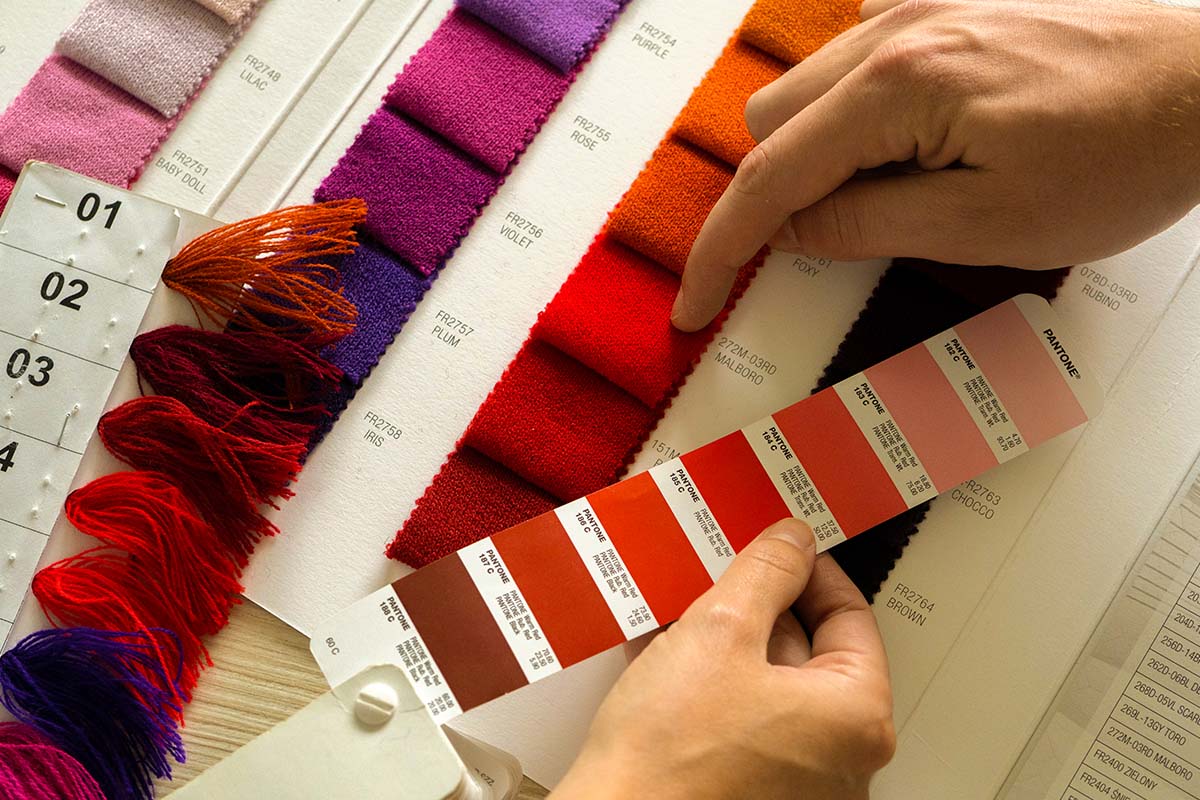
PMS
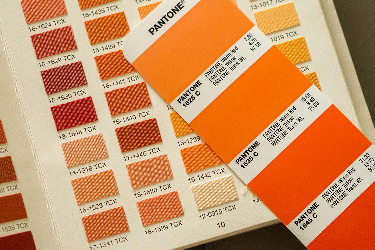
PMS stands for Pantone Matching System and consists of 18 base colors that can be combined to 1 867 mix colors. PMS colors are a globally used standard. This allows everyone to guarantee the match between the desired color and the ink color, which can differ if you don’t use PMS color.
The difference between process colors and spot colors.
Next to RGB-colors, CMYK-colors and PMS-colors, we speak of spot colors and process colors for printing. What is the difference and which color code do you need for what?
Process colors
Process printing refers to the technique of printing a full spectrum of colors using halftones of only 4 ink colors layered over each other: Cyan, Magenta, Yellow, and Black (or, CMYK). With process printing, the colors are not mixed. We use separate inks that are layered onto the paper.
Spot colors
A spot color is printed using one single ink, often made by physically mixing different base color inks to a formula from a Pantone guide book – similar to selecting a swatch when mixing some base paint colors to get a new color. Spot colors have a wider gamut than CMYK colors. There are spot colors which have no equivalent in CMYK – for example, metallic colors or fluorescent colors.
The difference between offset litho printing, digital printing and screenprinting.
Offset litho printing
Offset printing, also called lithography, is the most common kind of printing for high volume commercial jobs. Ever seen videos of newspapers running through big rolls? That’s offset printing.
Typically, CMYK colors are used (cyan, magenta, yellow and black (key), but offset printing also allows for custom ink colors (most notably Pantone colors) to be used instead. We use Pantone colors if we want a specific color result.
The process is called offset because the ink is first transferred from plate to blanket rather than going directly on to the paper. Because of the time and costs required for set up, plates and ink before anything is actually printed, offset isn’t cost effective for smaller amounts and is usually only used when very large volumes are required.
Digital printing
Digital presses use powdered toners instead of traditional inks. With the digital printing process, your artwork goes straight from your pdf to print.
This technique skips the proofs, plates and rubber bed and applies a design directly to the printing surface, either with liquid ink or powdered toner.
The inkjet or laserjet you hook up to your computer at home? That’s a digital printer. Large printing companies have ones that are bigger, faster and more precise, but it’s the same concept.
Screen printing
Screen printing is the process of pressing ink through a stenciled mesh screen to create a printed design. It’s a popular technique used in a whole range of different industries, so even if you’ve never heard of the term before today, it’s likely that you’ve worn or used a screen-printed product at some point without even realizing. The process is sometimes called serigraphy or silk screen printing, but all of these names refer to the same basic method.
Screen printing is an effective technique for creating bold canvases, posters and artwork, but the method can also be used to print fabrics and textiles, so it’s great for creating all sorts of custom clothing and products.
As discussed before, each color can look different when printed on a particular material. So without color codes (CMYK, RGB), it’s a big challenge to match the right colors to customers’ branding. Therefore, using the Pantone system, which often includes the color of the year, in screen printing can ensure brand colors are accurately matched and vibrant.
Why is Pantone important for textiles?
The Pantone Color Guide is a hidden blessing for fabric coloring in the textile business. For decades, clothing has been one of our most effective tools of non-verbal communication. And since clothing caters to the basic needs of a human being, you would want to consider company fashion. Consider a situation where a company wishes to make branded hoodies for its employees. They need 1000 hoodies that have been dyed in a “light, vibrant purple color.” But how can you tell which color he is specifically referring to? Your coworkers will have diverse perspectives in this situation, but there’s no choice that is 100% correct.
However, if you have a Pantone color guide with each swatch, this will be less complicated. You can rapidly find a color in the Pantone Guide if the customer refers to the pantone number rather than the name of the color, for example, “17-3938 Very Peri TPX.” In other words, the Pantone Book has made it simple to obtain ideas for specific colors before dyeing and to match colors with samples after coloring. And of course your customer will be happy with the hoodies since they are created in the exact same color as written in their brand guidelines.
How to use your pantone colors for your next company fashion collection?
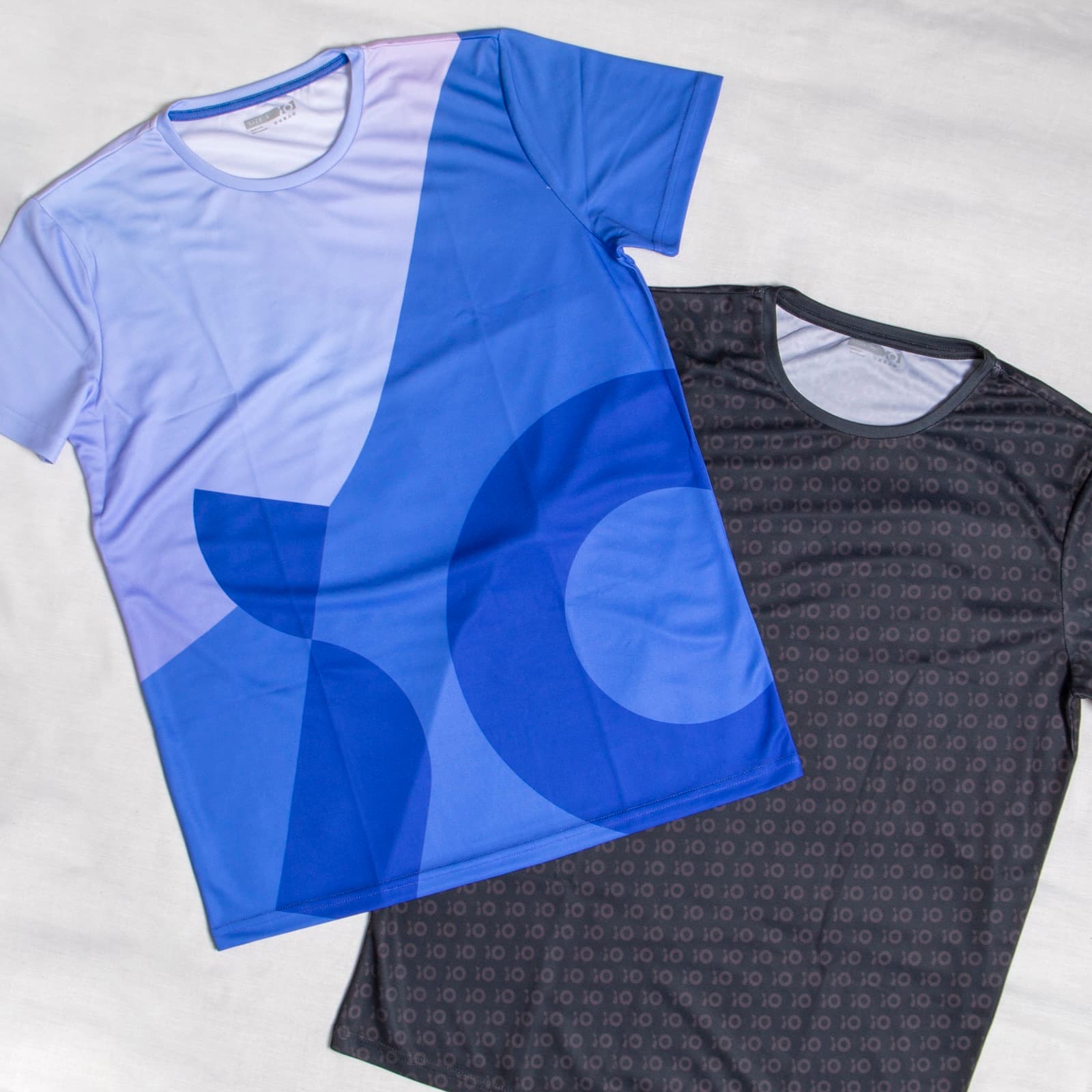
Pantone is a global leader in color standards for the fashion and Textile industry. PMS colors are also commonly used to print textiles with screen printing. Think T-shirts, sweaters or cotton bags: as long as it consists of one to four full colors. Once you need gradients or multiple colors, you should opt for a full-color printing process.
As a textile fashion company everyday we design> company fashion for the biggest market leaders. This means everyday we come in contact with pantone colors. For example if the brand identity of a company contains one specific color: 17-3619 Pantone TPG, Hyacinth, we know exactly what color should be used for the design.
In our industry, many textile companies that work in branded clothing or merchandising, will buy finished clothing items and then adapt those to the specific needs of their customers, for example by printing a logo on them or adding other decorative items. We take a different approach. We work the way you would expect from a fashion company; we buy raw materials and produce garments from scratch. This gives our design team so much more flexibility and possibilities to match (and exceed) the exact expectations of our customers.
Pantone colors for screen printing
Using pantone colors is ideal for non-fabric materials. The result can differ depending on the material and its color it is printed on. With textiles, this can be very challenging because the color of the textile influences the color of the ink.
It’s always safe to print on white textile. With colored textiles, we add an undercoat to make the colors pop. But why use Pantone colors to screenprint? What are the benefits?
- Every involved party knows exactly what the end product will look like.
- It guarantees the match between the desired color and the ink color.
- Brand colors can be 100% matched and the result will look flawless.
Pantone Guidebook
At Sunday we unite your brand identity and emotion of color. We are recognized as the #1 reference in Europe for premium sustainable company fashion with expertise in Pantone Color, including the selection of the color of the year, providing and developing a color and design approach consistent with their brand vision.
We use different tools to match exactly the defined pantone color on textile. One of the tools we use is the Pantone PMS Formula Guidebook for Screen printing. The book includes 1867 pantone spot colors with their corresponding ink formulations.
One of the most crucial aspects of pantone is that it is the expertise of the screen printer that can assure you the colors that you expect. So choose a reliable partner if you want top-quality printed textile.
We’re proud to say that through the years we have developed the expertise necessary to allow us to manage the entire process from A-Z, no matter which item our customer wants produced.
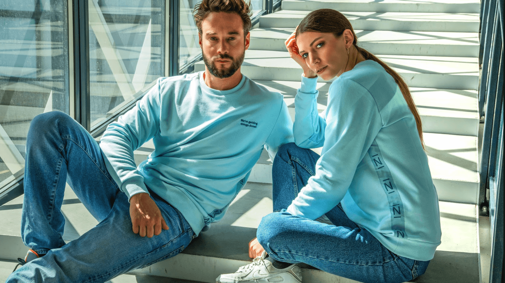
Sunday can guide you through the development of a company fashion collection based on a color strategy that fits your company’s unique needs in fashion. Check one of our favorite company fashion collections that uses pantone colors!
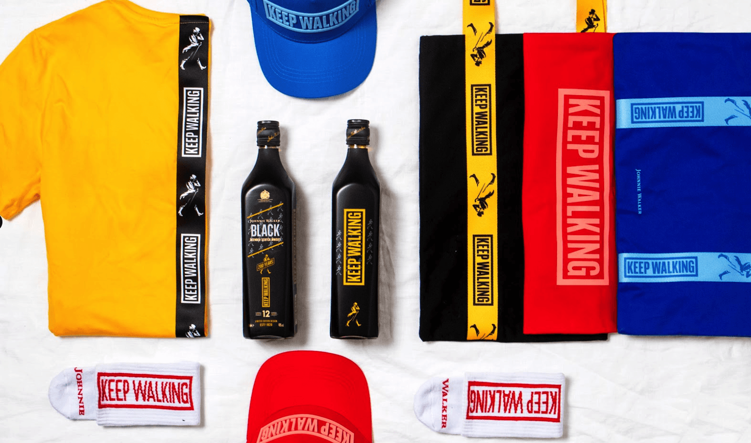
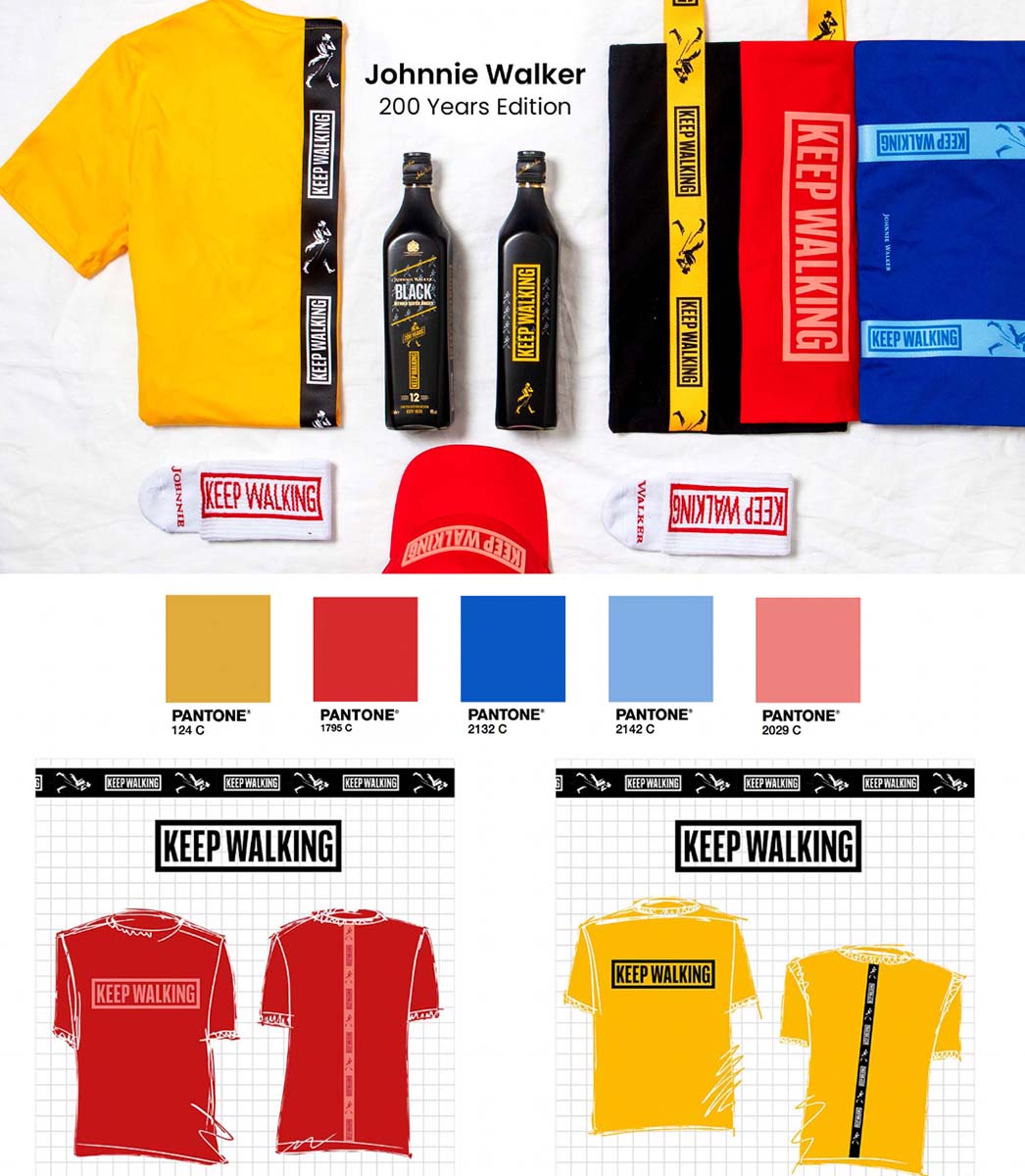
Achieving these designs for Johnnie Walker required a great amount of technical expertise. An initial challenge appeared to be matching the colors with Johnnie Walker’s visual identity. Their Pantone yellow, Pantone blue and Pantone red recur in every item. These colors, or approximations of them, appear in the socks as well as in the screen printing of the logo, the high-density print on the caps and the tapes.
More than 10 million designers and producers around the world rely on Pantone products and services to help define, communicate and control color across various materials and finishes for graphics, fashion and product design. Looking for a partner to take your branding and visibility to the next level?
We would love to help you.
Looking to start dressing your team?
Want to discuss a project? Interested in
visiting one of our offices? Let us know!