


Definition
A gradient in print is a smooth, gradual transition from one color or tone to another across a printed surface. Presses and screens lay down solid ink, so a printed gradient is really an illusion built from tiny dots that shift in size or spacing. Done well it looks seamless. Done badly it breaks into visible steps called banding.
Definition
A gradient, sometimes called a blend, fade or ramp, moves from one color to another across a shape or background. A screen or printhead can only apply solid ink, not a fractional amount, so a printer recreates the fade using halftone dots or a fine random dither. Where the color should be strong the dots grow large and dense. Where it should fade the dots shrink and pull apart. For example, a hoodie back print that runs from deep navy at the shoulders to sky blue at the hem is built from thousands of dots that gradually thin out, so from a normal distance your eye reads a smooth fall of color rather than a pattern.
How a gradient in print works
A gradient in print starts as a continuous blend in your design file. On a monitor that blend looks flawless because the screen mixes light in millions of steps. Print has far fewer steps, so the artwork first has to be converted into the colors the job will actually use, whether that is CMYK process inks or two spot colors. Only then is the blend rasterized into a dot pattern the press can hold.
The biggest enemy of a clean gradient is banding, where the fade jumps in visible stripes instead of flowing. It happens when there are too few tonal steps between the light and dark ends, or when the file is exported at low resolution. Dot gain adds to the risk. Ink spreads as it is pushed through a screen and pressed into fabric, so the darker end of a gradient can plug up and lose its smoothness. Good prepress work pulls very small highlight dots and controls the shadow end so the whole range stays printable.
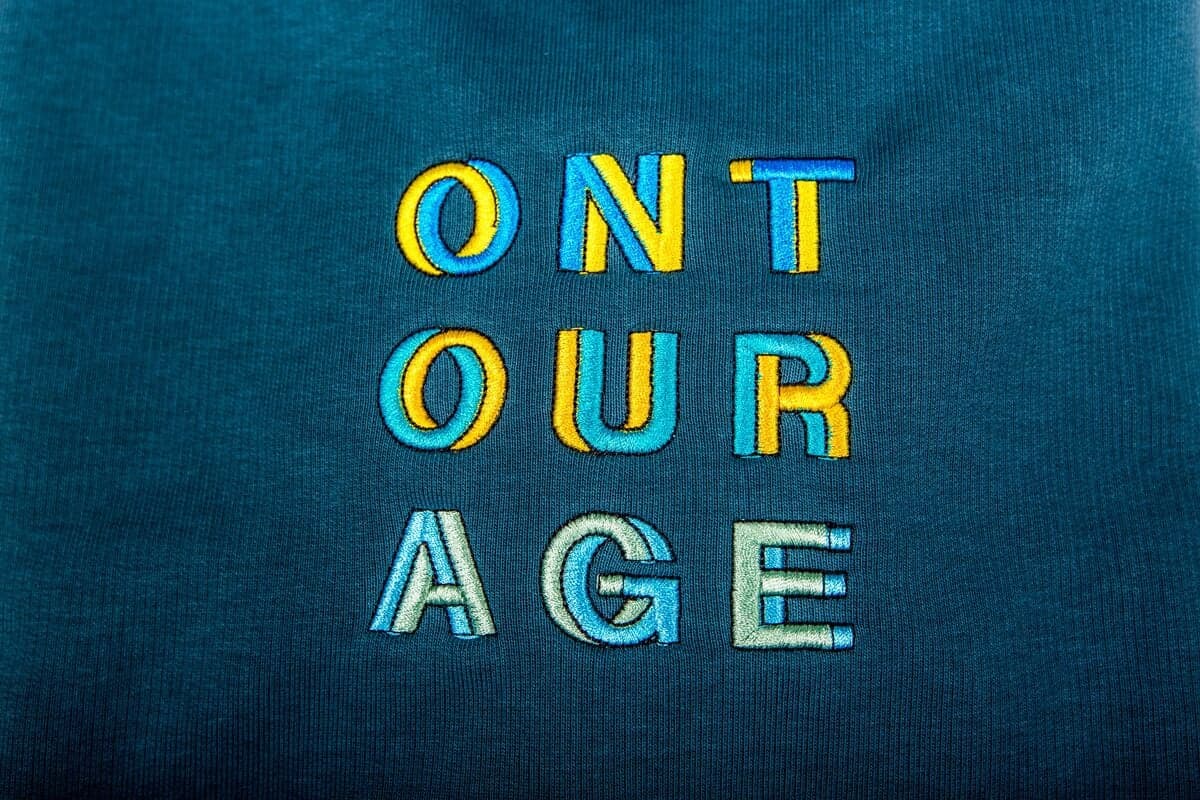
Method matters just as much as the file. Sublimation, DTG and DTF reproduce gradients almost natively because they print in fine, photographic detail. Screen printing has to simulate the blend with halftones and careful color separation, which works well but needs a skilled screener. Embroidery cannot form a true gradient at all, since thread is a solid color, so a fade there is faked by blending stitches of two or three shades.
Gradients in branded merch
- Brand fades and duotones. Reproduce a logo or background that blends between two brand colors, giving apparel and packaging a modern, designed feel instead of a flat block of color.
- Photographic and full-color art. Print an image with soft shading, sky, or skin tones using four-color process, where overlapping halftone gradients build a realistic picture on a t-shirt or tote.
- Depth and dimension in flat prints. Add a subtle gradient behind text or a mascot so a one or two color design gains shadow and glow without paying for extra inks.
A gradient in print is a gradual blend between two or more colors or tones, simulated on press by varying the size or density of tiny ink dots.
5 tips to elevate your Gradient in print strategy
| Tip | Steps |
|---|---|
| Build gradients in the print color space | Design the blend in CMYK or your spot colors, not RGB, so what you see is close to what prints. |
| Avoid pure fade-to-white unless intended | A gradient that drops to zero can leave a hard edge where the dots vanish, so end on a light tone if you want a soft finish. |
| Export at high resolution | Supply artwork at 300 DPI or as vectors so the blend has enough steps and does not band. |
| Match the method to the effect | Choose DTG, DTF or sublimation for smooth photographic gradients and reserve screen printing for simpler two-color fades. |
| Proof on the real product | Approve a sample on the actual fabric and color, since dot gain and garment shade both change how a gradient reads. |
Key Terminologies
Frequently Asked Questions
Why does my gradient look banded when printed?
Banding usually means there were too few tonal steps in the blend or the file was exported at low resolution. Rebuild the gradient in the print color space and supply it at 300 DPI or as a vector so the fade has enough steps to stay smooth.
Can you screen print a gradient?
Yes. Screen printing simulates a gradient with halftone dots that shrink and spread across the fade. It works well for one or two color blends, though very fine photographic gradients are easier with DTG, DTF or sublimation.
What is the difference between a gradient and a halftone?
A gradient is the smooth color transition you want to achieve. A halftone is the dot pattern used to reproduce it on press. Every printed gradient is really a halftone, but a halftone can also render solid photographs, not just fades.
Should I design gradients in RGB or CMYK?
Build them in the color space the job will print in, usually CMYK or your chosen spot colors. Designing in RGB can produce bright fades that shift or dull once converted for print, so working in the final space keeps surprises to a minimum.
Can you embroider a gradient?
Not as a true fade, because each thread is a single solid color. Embroiderers imitate a gradient by blending stitches of two or three shades, which reads as a soft transition up close but is coarser than a printed blend.