

Definition
PMS Color Matching, or Pantone Matching System, refers to a standardized color language that allows designers, manufacturers, and printers to communicate precise color specifications across different platforms and materials. This system uses an extensive library of predefined colors, each assigned a unique number that ensures the same shade is consistently replicated wherever it’s used.
“PMS Color Matching provides a universal color language that ensures consistency. It assigns specific numbers to shades for exact replication.”
For instance, consider a marketing agency producing merchandise for a new branding campaign. By utilizing PMS Color Matching, they can guarantee that the cyan used on custom t-shirts, business cards, and banners will all match perfectly, regardless of the substrate or printing process. This alignment across various mediums ensures that their client’s brand appearance remains cohesive and professional.
The Principles of Effective PMS Color Matching
The core principle of PMS Color Matching lies in its ability to provide consistency. Consistency is crucial in branding and product development, as it helps maintain a unified appearance across all marketing and product materials. By following standardized color codes, businesses eliminate variability and ensure that their visual identity remains strong and recognizable.
To achieve this consistency, PMS Color Matching operates on a standardized palette that includes over 1,000 distinct colors. Each color is assigned a unique number and formula, allowing manufacturers and designers to accurately reproduce tones. This ensures that, regardless of the material-be it paper, fabric, or digital screen-the color will appear the same. Utilizing PMS colors enables you to communicate your brand’s story effectively through design clarity, bridging any potential gap between your creative vision and production reality. The precision offered by PMS Color Matching means that while your product may journey through different manufacturing environments, the final result will always align seamlessly with your original design intentions.
Moreover, this color matching system simplifies communication in graphic design among designers, manufacturers, and clients. You maintain greater control and predictability over your project’s outcome.
In an ever-competitive market, cultivating a memorable visual impact is vital.
3 examples of powerful PMS Color Matching strategies
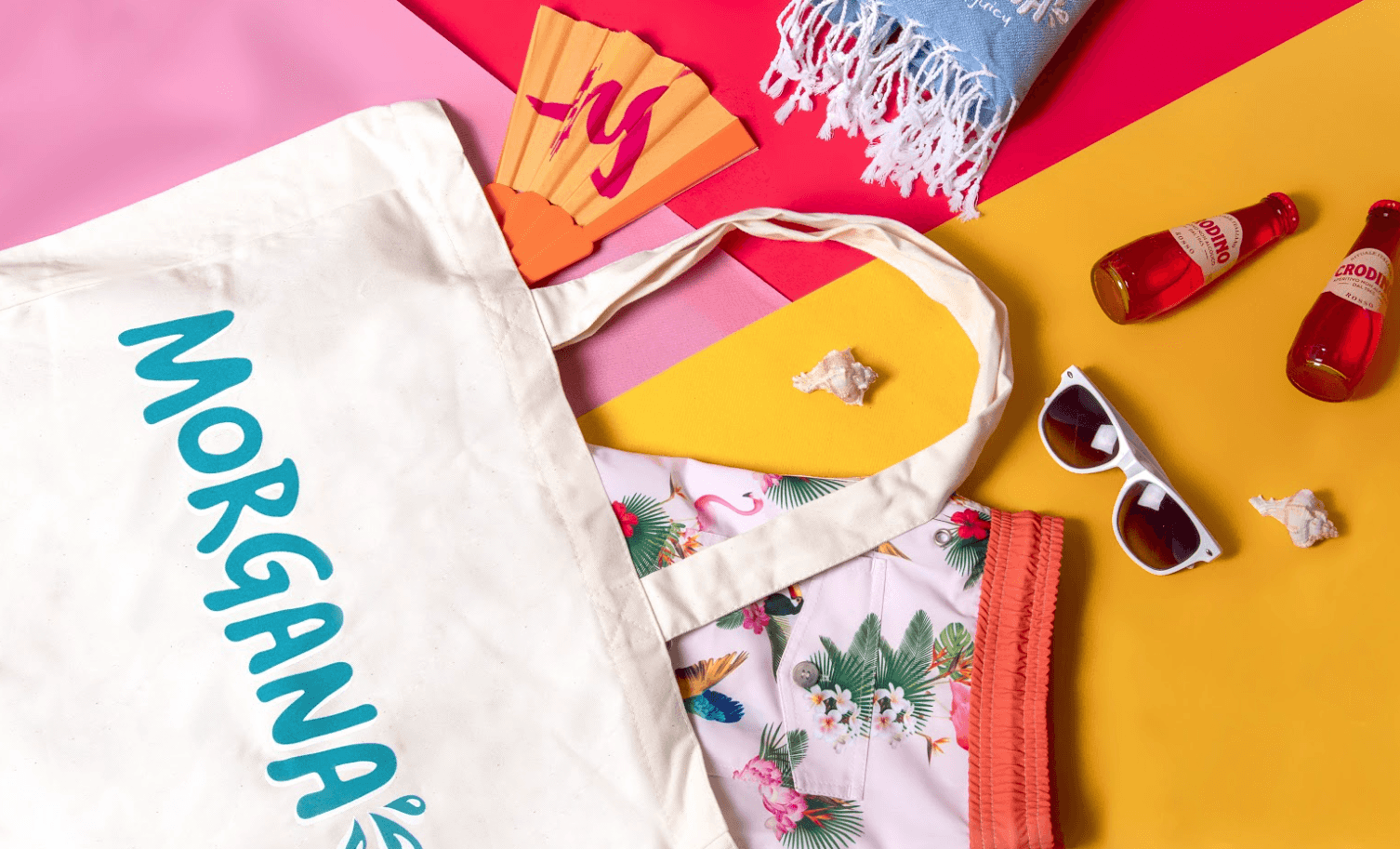
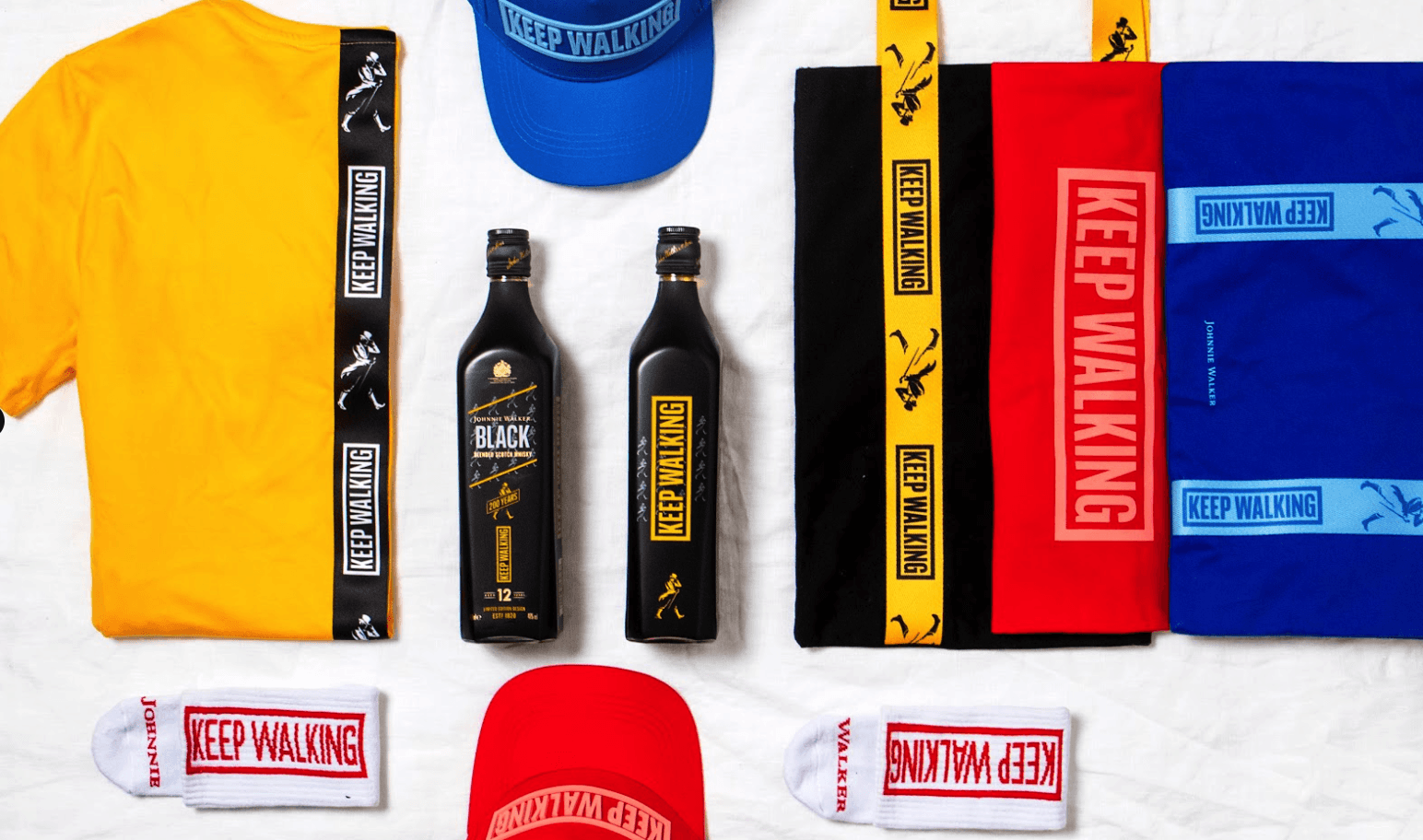
Corporations producing promotional products
: When a company plans to distribute promotional items at a trade show, such as pens or notebooks, PMS Color Matching ensures that all products reflect the precise brand colors. This consistency enhances brand recognition and lays the foundation for a seamless marketing strategy, regardless of the supplier or manufacturing process involved.
Fashion and textile designing
: Designers in the textile industry often face the challenge of color reproduction on different fabrics. By leveraging PMS Color Matching, they achieve perfect color matching from sketches to end products, maintaining design integrity. This allows designers to communicate their creative intent with confidence, ensuring the elegance and precision of each piece stand out on retail shelves.
Retail packaging design
: Packaging is a crucial aspect of product representation on store shelves. By implementing PMS Color Matching, companies can ensure the colors of packaging materials are consistent, from labels on bottles to exterior packaging boxes. Thus, they safeguard the perceived value of their products and maintain customer trust through visual reliability.
7 tips to elevate your PMS Color Matching strategy
| Tip | Steps |
|---|---|
| Join a webinar on color theory | Look for upcoming industry webinars on Pantone or color theory, and register |
| Experiment with a color guide | Purchase a Pantone color guide and practice matching different shades |
| Collaborate with a designer or color consultant | Reach out to a professional for tailored advice on specific projects |
| Use technology tools | Explore digital tools and applications designed for color matching accuracy |
| Study case studies of successful implementations | Research case studies of brands that have successfully utilized PMS Color Matching |
| Attend industry trade shows | Visit trade shows that focus on textiles and design and interact with industry leaders |
| Join a professional organization | Become a member of organizations related to design or textiles |
Key Terminologies
Frequently Asked Questions
How do I choose the right PMS colors for my project?
Selecting the right PMS colors begins by assessing your project’s needs, considering the brand identity, and using a Pantone guide to find complementary shades. Testing swatches ensures the perfect match across all materials.
Will using PMS Color Matching ensure my final print looks exactly the same as the design?
While PMS Color Matching significantly enhances color consistency, the final result may vary slightly due to material differences and printing methods. Always perform a test print to make adjustments if necessary.
How does PMS differ from CMYK printing processes?
PMS uses pre-mixed ink colors for precision and consistency, especially for specific shades, while CMYK blends four colors during printing, which can result in variations.
Can I match PMS colors to RGB for digital designs?
Yes, you can match PMS colors to RGB by using conversion charts or software tools, though some variations may occur due to the inherent differences between print and digital color models.
Is it worth investing in PMS Color Matching for small-scale projects?
Even small-scale projects benefit from PMS Color Matching, as it ensures brand consistency and professional aesthetic, which can be crucial for brand perception and recognition.
Are there tools available to help with PMS Color Matching?
Yes, numerous tools, such as Pantone swatch books, color matching devices, and software, assist in accurately matching and managing colors for your design projects.