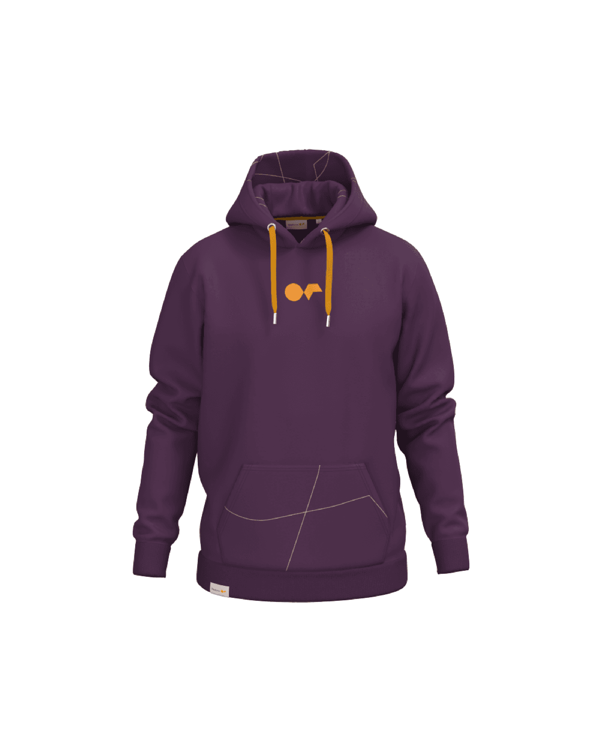
The custom polo shirts design examples that work share one rule: restraint. A small chest embroidery, a clean back, a fabric and fit that suit the team, and at most one or two subtle extra details. The strongest designs read as quality first and branding second. A bright brand colour can look intentional and professional, an oversized logo or a flex-printed back almost never can. Get the basics right and the polo looks good for years.
Most polo designs fail in the same predictable ways: the logo is too big, the back is covered, the decoration fights the fabric. The good ones avoid all three. We pulled a set of real company polos and broke down what makes each one work, so you can copy the thinking rather than the exact design. For the full background on every decision, the complete polo guide goes deeper.
The one rule behind every good polo
Before the examples, the principle they all share. A polo sits between a T-shirt and a formal shirt. It is the easiest way to make a team look professional without making them feel overdressed. The design has to protect that. The moment a polo starts shouting, it slides from corporate apparel into promotional swag.
So the working rule is simple. One strong, small mark plus one or two subtle details beats branding in every available position. Everything below is a variation on that idea.
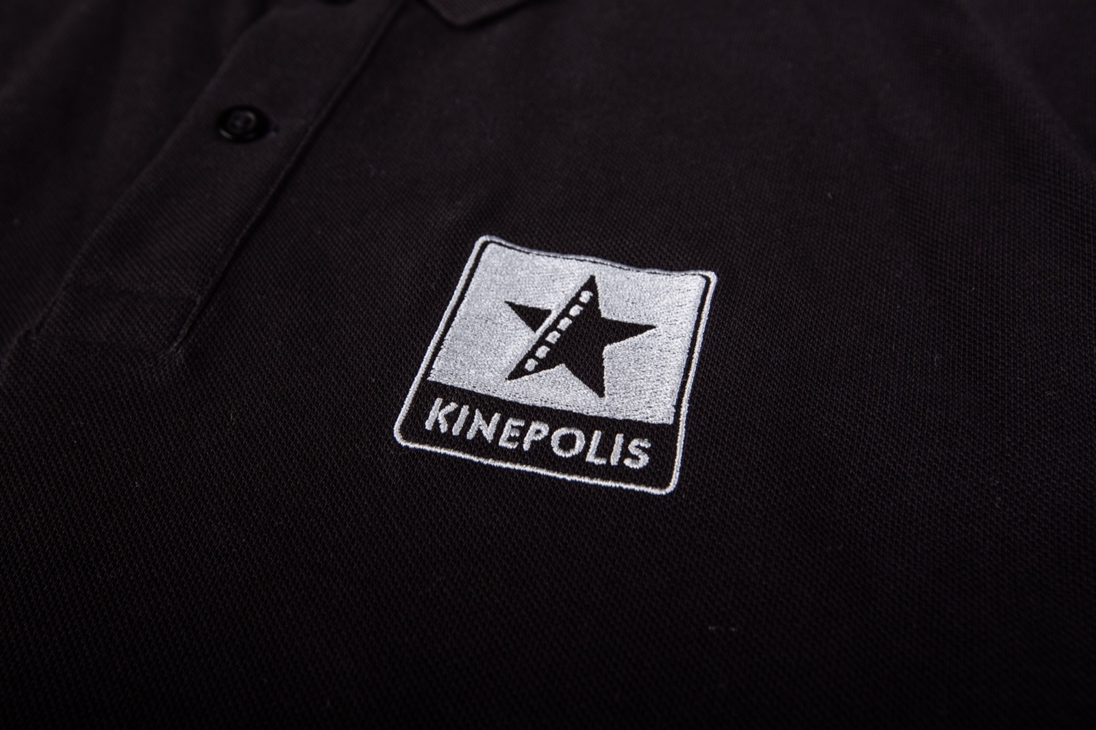
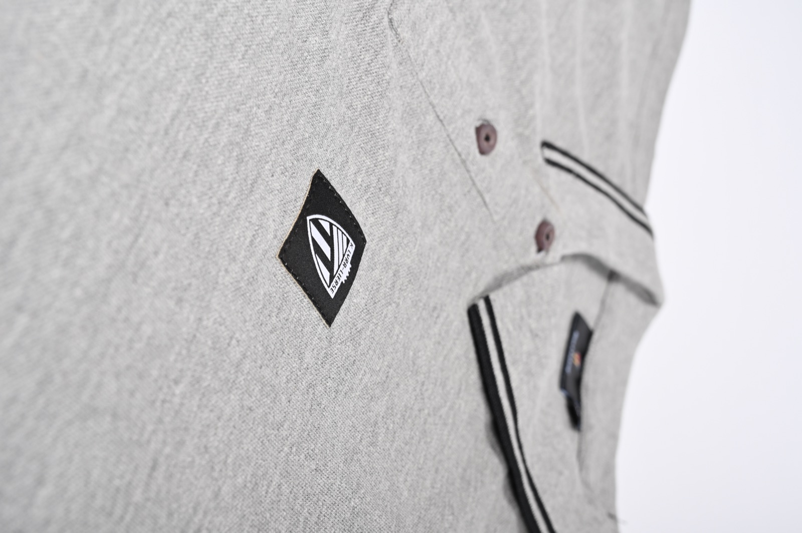
1. The restrained chest embroidery
The default that almost never fails. A small logo embroidered on the left chest, sized so you read the polo first and the brand second. It works because embroidery suits the textured piqué surface, holds up through years of washing, and signals quality the way a print never will.

The restrained chest embroidery. Small, crisp, positioned on the left chest. This is the safest design for any team and the one fewest people will want to change.
Why it works: the branding is unmistakable up close and invisible from across a room, which is exactly right for a sales or office team.
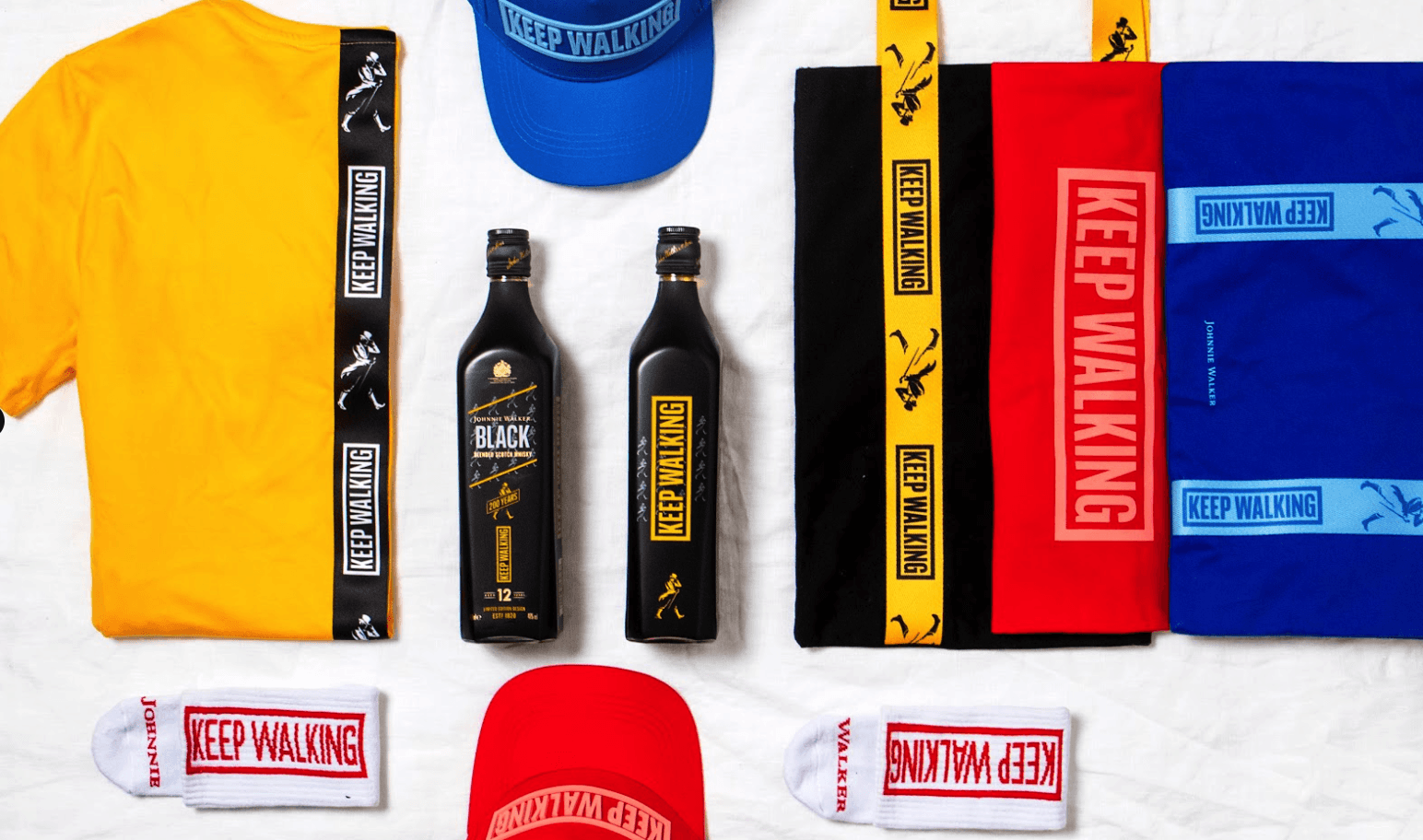
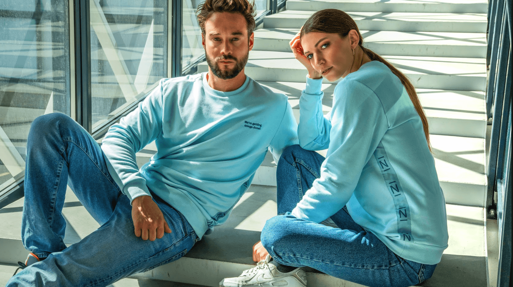
2. The intentional brand-colour polo
A bright or strongly coloured polo is not a risk when the colour belongs to the brand. The trick is to commit. A polo in a confident brand colour, with a tonal or subtle chest mark, looks deliberate and premium. The same colour chosen at random looks like a giveaway.
Brand colour done on purpose. When the polo colour matches a confident identity, it reads as intentional, not promotional. Decide the colour first, then keep the branding subtle.
This design works hardest for retail, service and customer-facing teams, where recognition is the function. There you can turn the colour and customisation up, because customers need to spot your people at a glance.
3. The clean minimalist polo
Sometimes the best branding is barely there. A neutral polo, a structured collar that holds its shape, and a single tonal logo or a woven label near the hem. This design leans entirely on garment quality, so it only works if the polo is genuinely good. Cheap fabric has nowhere to hide.
Minimalist by design. With a tonal mark or a sewn label, the polo lets fabric, collar and fit do the talking. Substantial, not heavy, is the look you want.
Why it works: it ages well and suits brands that prefer understatement. It is also the most forgiving across a mixed team, since there is no loud element to clash with anyone.
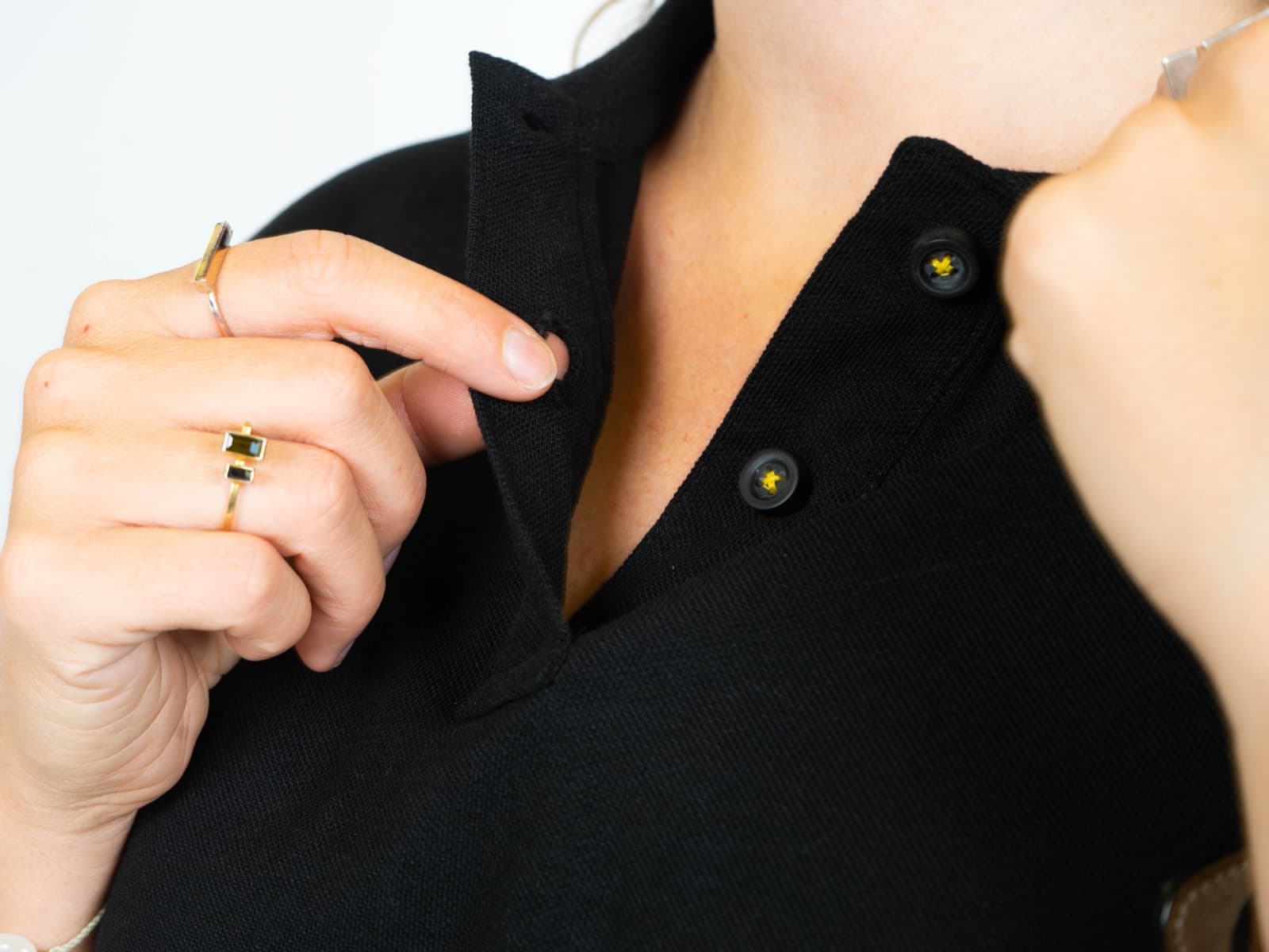
4. The subtle contrast detail
One small contrast element lifts a plain polo without tipping into noise. A contrast collar trim, contrast buttons, a sleeve patch or a coloured side placket. Pick one. The mistake is stacking three or four contrast details until the polo looks busy.
- Contrast collar or placket. A quiet way to add brand colour.
- Branded or contrast buttons. A finishing detail people notice up close.
- Small sleeve embroidery or patch. A second mark that stays subtle.
- Woven or leather label. Premium branding near the hem.
Why it works: it adds personality while keeping the chest mark as the hero. To preview a detail on your own colours before you commit, use the free polo mockup generator.
Designs to avoid
The failures are as instructive as the wins. Steer clear of these and most of the work is done.
| Avoid | Why it fails |
|---|---|
| Oversized chest logo | Reads as promotional, not professional. The fastest way to make a good polo feel like event swag. |
| Large back print | Looks like workwear advertising. Keep the back clean. |
| Flex printing on piqué | Sits on the textured fabric like a plastic slab and undermines the whole garment. |
| Branding in every position | Chest, sleeve, back, hem all at once. Busy beats balanced every time, in the wrong direction. |
| The cheapest blank | Weak collar, poor fit, loses shape fast. No design survives a bad base polo. |
Design your own
Every example here comes down to the same short checklist.
- Start with a quality polo, never the cheapest blank.
- Make a small chest embroidery the hero.
- Keep the back clean.
- Choose colour on purpose to match the brand.
- Add at most one or two subtle details.
You can move straight from these ideas to a real design. The Sunday platform uses your brand data to generate on-brand polo concepts with live pricing in about 30 seconds. Browse custom polos, explore the full catalog, or see how it works. Ready-to-wear starts from around 10 pieces, fully custom from around 150.
Custom polo shirt design examples: questions answered
What makes a custom polo shirt design work?
Restraint. The designs that work use a small chest embroidery, a clean back, a quality fabric and fit, and at most one or two subtle extra details. They read as quality first and branding second. An oversized logo, a large back print or flex printing on piqué almost always make a polo look promotional rather than professional.
Where should the logo go on a company polo?
A small embroidery on the left chest is the default and the safest choice. Keep it restrained so the polo reads first and the brand second. You can add one subtle second mark, like a small sleeve embroidery or a woven label near the hem, but keep the back clean. Branding in every position looks busy, not premium.
Can a brightly coloured polo still look professional?
Yes, when the colour belongs to the brand and you commit to it. A polo in a confident brand colour with a tonal or subtle chest mark looks intentional and premium. The same bright colour chosen at random looks like a giveaway. Decide the colour on purpose, then keep the branding quiet.
Should I use embroidery or printing for the design?
Embroidery, or a sewn detail like a woven patch or label, in almost every case. Piqué has a visible texture, so screen printing is less crisp than on a tee and flex printing looks like a plastic slab on the fabric. Embroidery suits the surface, lasts through years of washing and signals quality.
How many design details should a polo have?
One hero mark plus at most one or two subtle details. A small chest embroidery as the hero, then optionally a contrast collar, branded buttons, a sleeve patch or a hem label. Pick one or two, not all of them. Stacking contrast details quickly makes a polo look busy instead of balanced.
How fast can I see a polo design for my company?
About 30 seconds on Sunday. Opening a polo product page generates on-brand design directions from your existing brand data, with live pricing and the available decoration options. You can pick a concept, request a variation or use it as a custom starting point before briefing anyone.
Keep reading: custom polo shirts
See your polo design in 30 seconds
Create a free account and preview an on-brand polo with restrained embroidery, in your colours, with live pricing.
Get free designs