The most common mistake in logo sock design is making the logo too prominent. It sounds counterintuitive. You're paying for branded socks, so naturally you want the logo front and center. But the socks that people actually wear repeatedly are the ones where the design works as a whole, and the branding is one element within it.
Think about it from the wearer's perspective. They're choosing what to put on their feet for a 12-hour day. A sock that looks like a walking billboard for your company goes back in the drawer. A sock that looks like a well-designed retail product with your brand subtly woven in? That gets worn every week.
This guide covers the specific design decisions that separate wearable logo socks from forgettable ones: placement, color, pattern, material, and packaging. Plus a briefing template you can send straight to your manufacturer.
- 6-8: max colors for knitted logo sock designs.
- 144+: needle count needed for crisp logo reproduction.
- 3x: higher wear rate for subtle vs oversized logo placement.
The core principle: design first, logo second
The best logo socks start as good sock designs. The designer creates a compelling pattern, colorway, and overall aesthetic. Then the brand mark gets integrated. Not the other way around. When you start with "make the logo as big as possible," you end up with a sock that only gets worn at the company offsite.
Look at how premium sock brands (Stance, Happy Socks, Falke) handle branding. The brand mark is small, positioned at the cuff or sole. The design is the star. Apply the same thinking to your logo socks and the results will be dramatically better.
Logo placement zones
| Zone | Visibility | Best for | Notes |
| Cuff (top band) | High when seated | Wordmarks, horizontal logos | 2-3cm max height for clean look |
| Upper leg | High, largest canvas | All-over patterns, centered logos | Don't fill the entire area with one giant mark |
| Ankle | Medium | Icon marks, small badges | Works well for secondary branding |
| Sole | Hidden (surprise element) | Messages, full logos | Premium feel; discovered on removal |
| Toe | Hidden | Small icons | A fun detail that rewards attention |
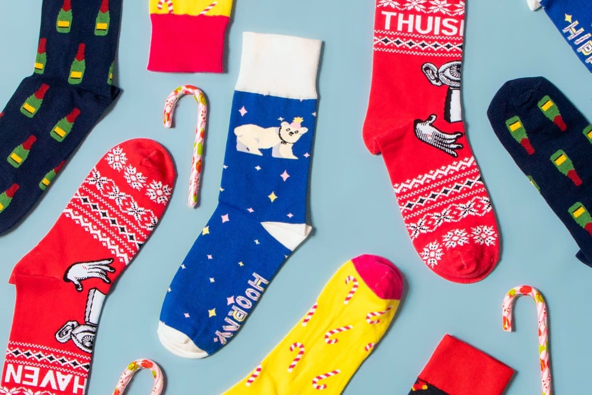
Pattern repetition and all-over designs
The single most effective technique for logo socks: shrink your logo to 1-2cm and repeat it as an all-over pattern. At small scale, the logo becomes a texture. From a distance, it looks like an interesting pattern. Up close, the brand is visible. This approach consistently produces the most-worn branded socks because it reads as design, not advertising.
Alternate the logo with complementary graphic elements (dots, stripes, geometric shapes in brand colors) to create rhythm. A grid of identical logos is monotonous. A pattern that incorporates the logo into a visual language is compelling.
Pantone matching and contrast
Color accuracy is non-negotiable for logo socks. Specify exact Pantone codes in your brief and insist on a pre-production sample to verify the match. Yarn dye lots vary, and "close enough" blue is not your brand blue.
Contrast matters for knit legibility. A navy logo on a black sock? Invisible. A white logo on a charcoal sock? Crisp and clean. Always ensure minimum 40% brightness difference between your logo color and the background. If your brand colors don't naturally provide enough contrast, adjust the sock background color rather than altering the logo.
Woven vs printed effects
Woven (knitted-in): Logo is part of the fabric. Permanent. Feels premium. Limited to 6-8 colors and simplified shapes. Best for 90% of logo sock applications.
Printed (sublimation): Full color, photographic quality. Sits on top of the fabric. Requires polyester content. Use only when your design genuinely needs gradients or photographic elements that knitting can't reproduce.
When in doubt, go woven. The quality perception difference is significant, and most logos work perfectly within the 6-8 color limit of knitting.
Do and don't examples
Design dos
- Use your logo as one element in a broader pattern
- Match the sock base color to your brand palette
- Keep the logo under 3cm at its largest point
- Use the cuff or sole for wordmarks
- Create contrast between logo and background
Design don'ts
- Stretch the logo across the entire leg
- Use more than 6-8 colors in a knitted design
- Place detailed logos below 144-needle knit resolution
- Use low-contrast color combinations
- Put the same giant logo on both sides of the sock
Packaging for logo socks
The packaging reinforces the design quality. A well-designed sock in a plastic bag feels like a freebie. The same sock with a kraft belly band and a small brand mark feels like a purchase. Match packaging investment to the sock quality: belly bands for standard distribution, individual boxes for gifts, premium boxes with tissue for executive gifting.
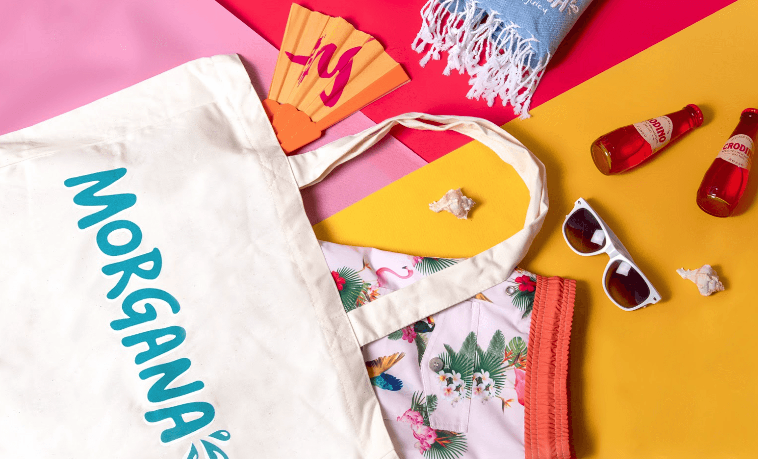
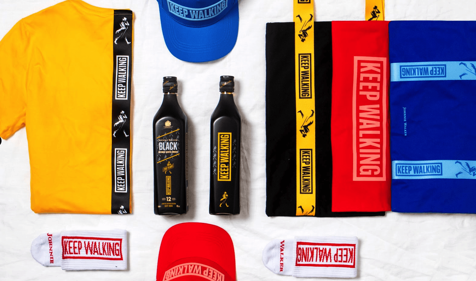
Matching socks with merch collections
Logo socks work best as part of a coordinated merch collection. Use the same color palette across socks, caps, T-shirts, and bags. This creates visual consistency that makes each item feel more intentional. Design your sock to complement, not duplicate, the other items. If your T-shirt has a large logo, make the sock subtle. Variety across items keeps the collection interesting.
Design briefing template
Sock design brief
- Brand name: [Your brand]
- Logo file: [Attach vector file, .ai or .svg preferred]
- Pantone colors: [List exact Pantone codes for all brand colors]
- Sock style: [Crew / Ankle / No-show]
- Material preference: [Cotton / Bamboo / Merino / No preference]
- Logo placement: [Cuff / Leg / Sole / All-over pattern]
- Design direction: [Subtle and premium / Bold and eye-catching / Minimalist]
- Use case: [Onboarding / Event / Gift / Retail]
- Quantity: [Estimated pairs needed]
- Reference images: [Attach any sock designs you admire as inspiration]
- What to avoid: [Anything specific you don't want in the design]
How to brief a logo sock design
From brief to wearable branded socks in five steps.
Fill out the brief template
Share your logo (vector), Pantone codes, preferred placement, and design direction. The more specific, the faster the first mockup.
Review digital mockups
Sunday's design team delivers 2-3 mockup options within 48 hours. Each optimized for the knitting process and your specified material.
Refine until it's right
Unlimited revisions. Adjust colors, scale, placement, pattern density. The design isn't final until you say it is.
Approve a physical sample
For first orders, we recommend a physical sample. Wear it. Wash it. Check the logo. Then give production approval with confidence.
Produce and deliver
Manufacturing, QC, packaging and delivery managed end-to-end. Your logo socks arrive exactly as approved.
Free design support, Pantone matching, unlimited revisions. 100-pair minimum. Start your logo sock project.