

Definition
A one-color logo is a version of your logo drawn in a single ink or thread color, with no gradients, tints, or extra shades. It is the format most decoration methods prefer, because one color prints cleaner, costs less to set up, and reproduces the same way across almost any product or fabric.
Definition
A one-color logo strips a mark down to one flat color plus the surface it sits on. Every shape is either printed or left blank, so there are no soft shadows, no color blends, and no secondary tones to reproduce. Take a logo that normally uses navy, gold, and grey. Its one-color version keeps only the essential shapes in a single ink, say solid black or solid white, so the mark still reads clearly with none of the color detail. This is the file a printer or embroiderer wants when a product only supports one color.
How a one-color logo works
A one-color logo usually starts as a redraw of the full-color artwork. A designer removes the color information and rebuilds the mark so it holds together in one tone. Thin outlines get thickened, overlapping elements get separated, and any shape that relied on color contrast is reworked so it reads as solid or empty. The result is saved as vector art, which keeps the edges crisp at any size and separates cleanly for production.
The single color links directly to how the product is decorated. In screen printing, one color means one screen and one pass, which is the cheapest and fastest setup. In embroidery, it means one thread color, so the stitch file stays simple and clean. Engraving, debossing, and laser marking are one-color by nature, since they cut or press the surface rather than add ink. For these methods, a one-color logo is not a downgrade, it is the correct starting file.
The trade-off is detail. A logo that leans on color to separate its parts can lose meaning in one tone, so the one-color version often needs deliberate redrawing rather than a simple color swap. The payoff is flexibility. One clean single-color file works across ink, thread, foil, and engraving, prints consistently on light and dark products, and keeps small or low-cost items on brand. Most merch programs keep a one-color logo alongside the full-color master for exactly this reason. It is the version that goes almost anywhere.
One-color logo in branded merch
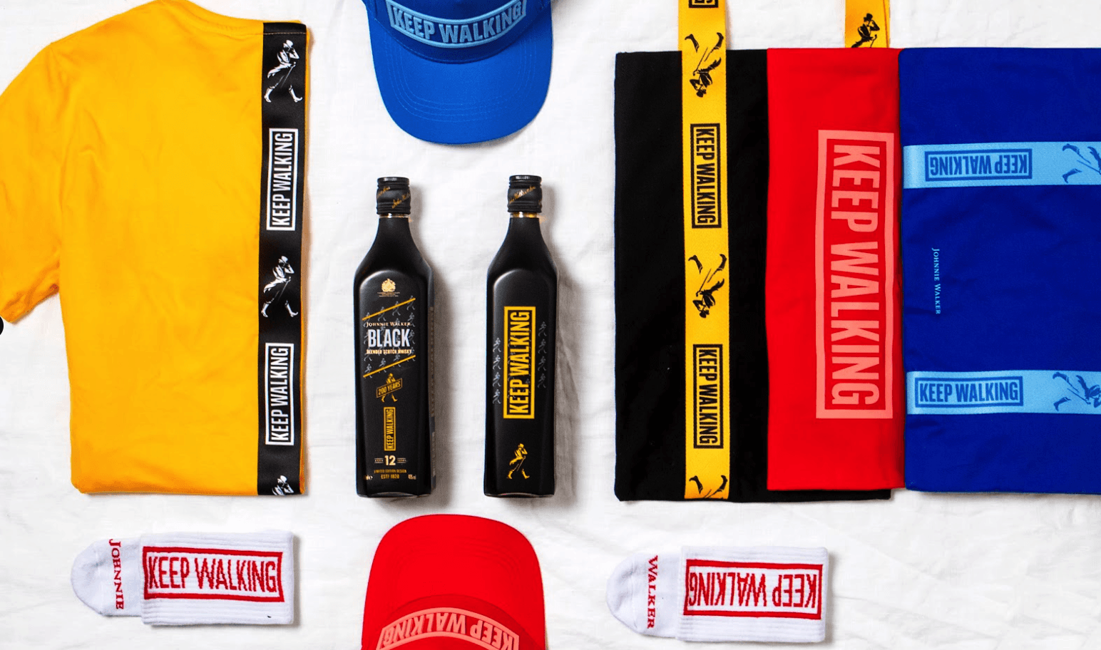
- Single-color apparel prints. For budget tees, tote bags, and event giveaways, a one-color logo prints through a single screen, which keeps the per-unit cost low on high volumes.
- Embroidery on caps and polos. Embroidered decoration reads best with defined shapes, and a one-color logo in a single thread stitches cleanly on caps, beanies, and polos without crowding the design.
- Engraved and debossed items. Metal bottles, pens, and leather goods are marked in one tone by cutting or pressing the surface, so a one-color logo is the only file that suits these products.
A one-color logo is a single-color version of a logo, rendered in one solid ink or thread with no gradients or tints, built for clean and consistent decoration.
5 tips to elevate your One-color logo strategy
| Tip | Steps |
|---|---|
| Prepare it in advance | Create a one-color version of your logo early, so you are never stuck when a product supports only one color. |
| Redraw, do not flatten | Rebuild the mark so it reads in one tone, rather than just deleting the colors and hoping it holds. |
| Test on dark and light | Check the logo in both solid black and solid white, since products come in every background color. |
| Supply vector files | Send clean vector artwork so the single color separates sharply for print or stitch. |
| Set a knockout rule | Decide how thin lines and enclosed shapes behave, so small details do not fill in or disappear. |
Key Terminologies
Frequently Asked Questions
What is a one-color logo used for?
A one-color logo is used for decoration methods that apply a single tone, such as one-color screen printing, single-thread embroidery, engraving, and debossing. It keeps setup simple and cost low, especially on high-volume or budget merch.
Is a one-color logo the same as a black and white logo?
Not quite. A black and white logo is a common example of a one-color logo, but the single color can be any ink or thread, such as white on a dark product or a brand color on a light one.
Why does my printer want a one-color version of my logo?
Many decoration methods only apply one color at a time, or become far cheaper with a single color. A ready-made one-color logo lets the printer set up quickly and produce a clean, consistent result.
How do I make a one-color logo from a full-color one?
A designer redraws the mark so it reads in a single tone, removing gradients and color separations and adjusting shapes that relied on color contrast. The final file should be saved as vector art for clean reproduction.
Can a one-color logo print on dark products?
Yes. A one-color logo prints just as well on dark items, usually in white or a light ink, as long as you have a version tested to read clearly against a dark background.