Definition
Pantone is a standardized color matching system that gives every color a unique number, so the same shade prints identically no matter who produces it. It exists to remove guesswork from color. When your brand blue has a Pantone code, a printer in one country and a factory in another can both hit the exact same blue.
Definition
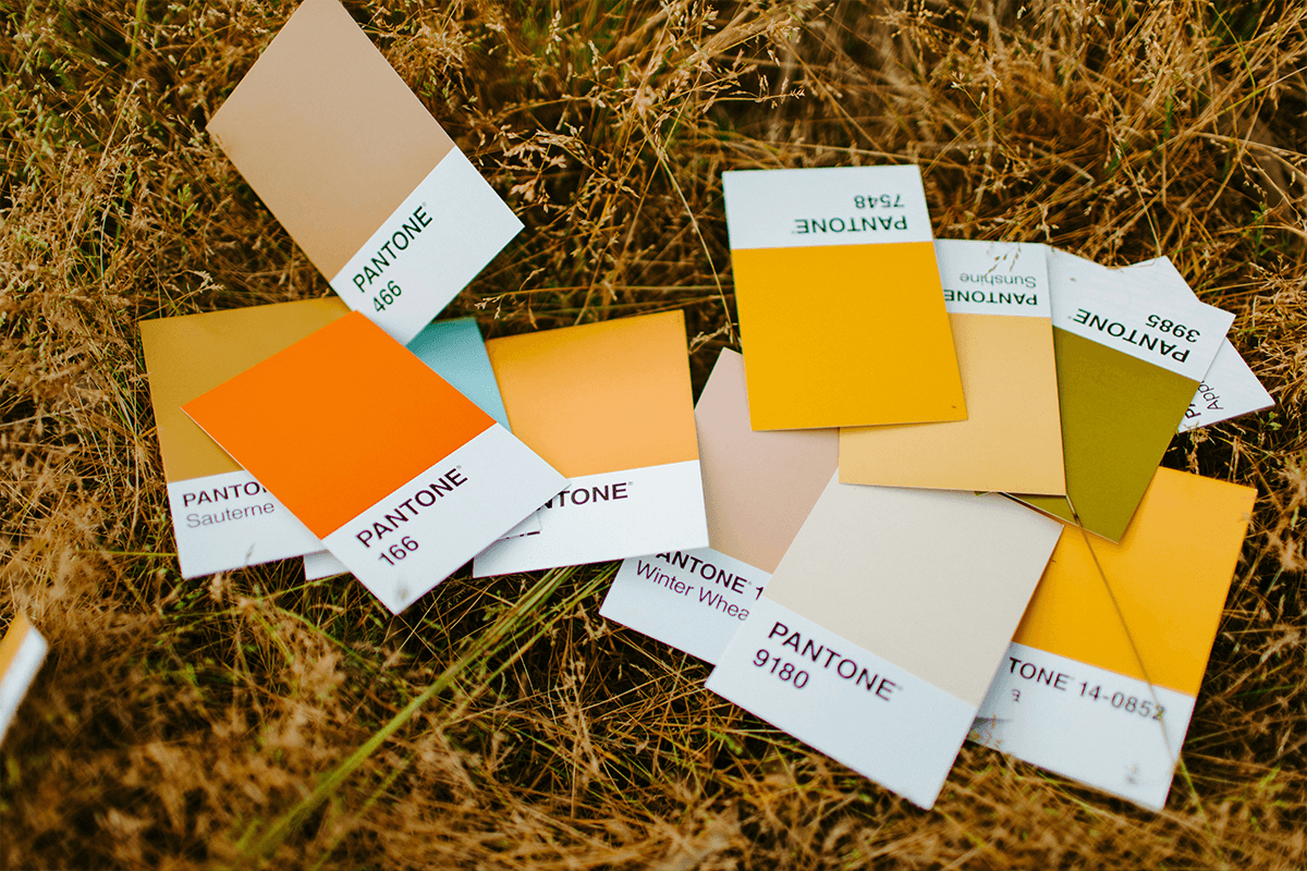
Pantone, run by the Pantone Color Institute, assigns each color a code in the Pantone Matching System, known as PMS. A code looks like "PMS 286 C" or "PMS 186 C". The number identifies the ink recipe and the letter tells you the paper or finish, C for coated and U for uncoated. Because the recipe is fixed, the color stays consistent. A real example: Tiffany blue is registered as a custom Pantone color, which is how the brand keeps its boxes the same shade worldwide.
How Pantone works
Pantone colors are spot colors. Instead of mixing tiny dots of four process inks to fake a shade, a printer mixes a single pre-formulated ink to match the Pantone recipe exactly. That single ink is laid down as one solid color, which gives cleaner edges and far more reliable matching than process printing. This matters most for logos, where even a slight color shift looks wrong.
Each Pantone code is documented in physical swatch books and digital libraries. A designer specifies the code, the supplier pulls the same reference, and both sides are looking at one shared truth. The trade-off is cost and flexibility. Spot inks add setup steps, so they suit solid brand colors more than full-color photographs. They also behave differently across materials. The same PMS code can look slightly warmer on cotton than on coated paper, which is why surface and finish always go in the spec.
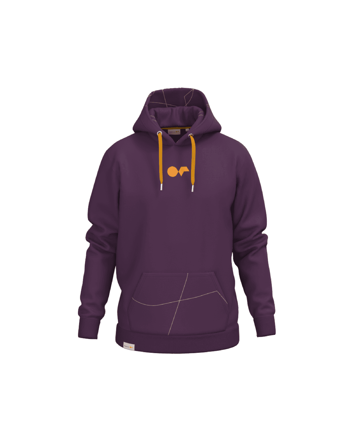
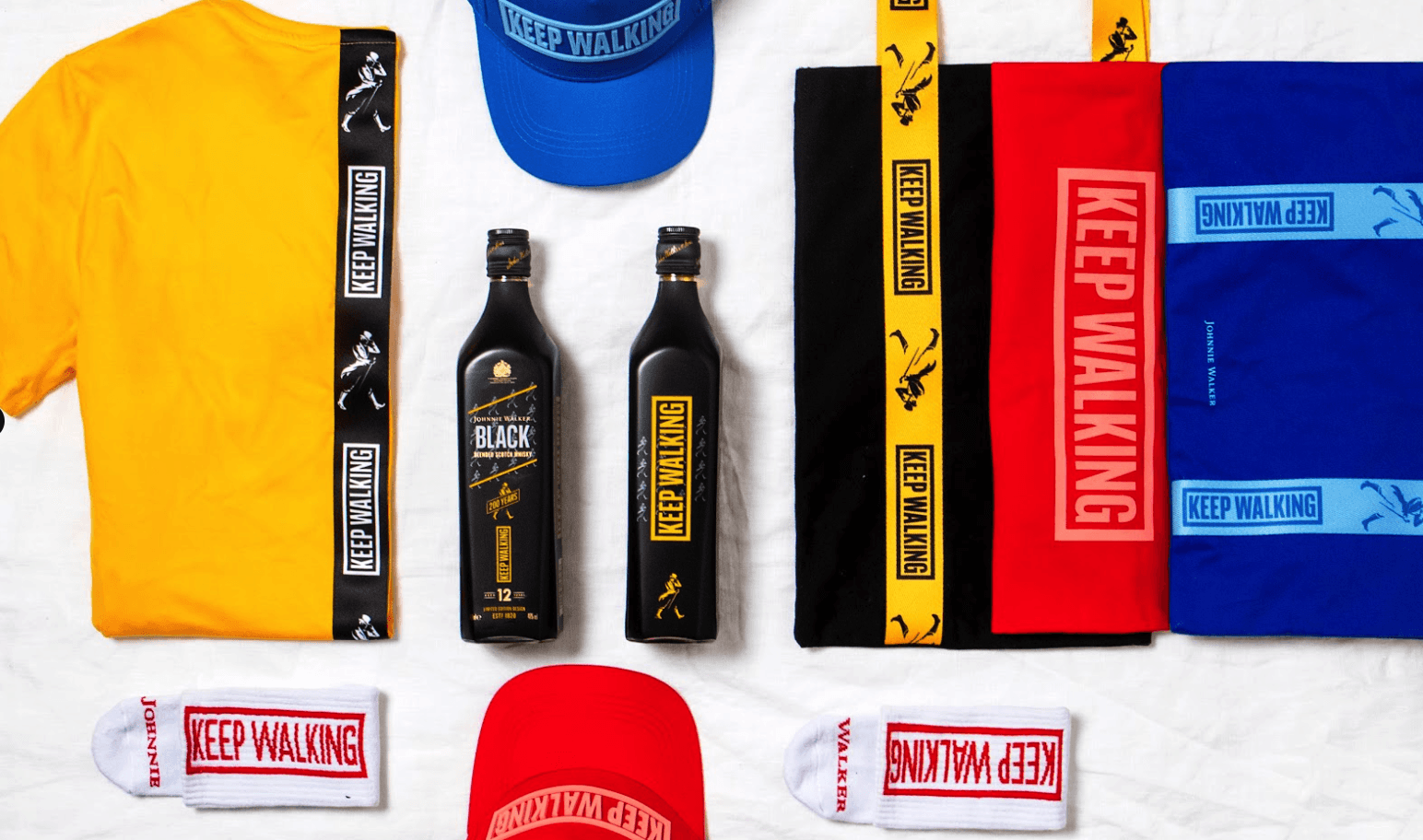
For merch, Pantone is the bridge between a brand guideline and a physical product. Your brand book lists a Pantone code, and that code travels with the order to whoever decorates the item.
Pantone in branded merch
- Locking brand color across product types. A single PMS code keeps your logo the same red on a cotton tee, a hard plastic bottle, and a paper notebook, even though each material takes ink differently.
- Briefing multiple suppliers. When several decorators produce one campaign, the Pantone code is the shared instruction that stops mismatched batches from reaching your team.
- Approving production samples. Comparing a finished sample against the Pantone swatch gives a clear pass or fail, instead of a vague debate about whether the color looks right.
Pantone is a universal color reference system where each color has a fixed number that any supplier can reproduce precisely.
5 tips to elevate your Pantone strategy
| Tip | Steps |
|---|---|
| Specify coated vs uncoated | Always include the C or U suffix, since the same number prints differently on each surface. |
| Match to the material, not the screen | Approve color against a physical swatch on a similar substrate, not a monitor. |
| Document codes in your brand kit | Store exact PMS codes alongside your logo files so every order starts from the same reference. |
| Allow for fabric color | On colored garments, ask for a sample, because the base color shifts how the ink reads. |
| Limit spot colors per item | Fewer Pantone colors per decoration usually means lower setup cost and faster production. |
Key Terminologies
Frequently Asked Questions
Is Pantone the same as CMYK?
No. Pantone uses pre-mixed spot inks identified by a code, while CMYK builds color from four process inks. Pantone gives more reliable matching for solid brand colors.
Why does my Pantone color look different on fabric?
Materials absorb and reflect ink differently. The same code can look slightly warmer or duller on cotton than on coated paper, so always check a sample on the real substrate.
What do C and U mean in a Pantone code?
C means coated paper and U means uncoated. The same ink recipe appears different on each surface, so the suffix tells the printer which reference to match.
Do I need a Pantone code for my merch?
It helps a lot. A Pantone code lets any supplier reproduce your brand color exactly, which keeps every product consistent. Without one, color is left to interpretation.
Can every decoration method match a Pantone color?
Most can get very close, but accuracy varies by method and material. Screen printing and pad printing match well, while some full-color digital prints only approximate it.