
Definition
A reversed logo is a version of your logo prepared to sit on a dark or colored background, with the artwork switched to a light color, usually white, so it stays legible. It is the counterpart to your primary logo, which is built for light backgrounds. Most brand guides ship both, so the mark reads cleanly whether it lands on a white mug or a black hoodie.
Definition
A reversed logo flips the tonal logic of your mark. Where the primary logo uses dark ink on a light surface, the reversed version uses light ink on a dark surface, so contrast is preserved. It is sometimes called a knockout, negative, or white version. A reversed logo is not always a simple color inversion. A colored icon may stay on-brand while only the wordmark and tagline switch to white. For example, a brand guide might carry a black logo for pale products and a white reversed logo for navy caps, dark totes, and charcoal tees.
How a reversed logo works
A reversed logo starts in artwork prep. A designer takes the vector master and produces an alternate version where the relevant elements are set to white or a light tint, then checks that no detail disappears against the intended background. Thin lines, small serifs, and tight counters are the risk areas, because they can close up or vanish when the surrounding dark takes over. A good reversed file often uses slightly heavier strokes so fine parts survive on fabric and print.
On the production side, the method decides the effort. In screen printing, a white reversed logo on a dark garment usually needs a white underbase so the top color sits bright instead of soaking into the fibers. In embroidery, the reversed version simply switches to white or light thread, though very fine text may need to grow to stay stitchable. In engraving or debossing, the reversed effect comes from the substrate itself, where a lighter layer or the natural material shows through the dark top surface.
The trade-off is control at the edges. Light ink on dark can look thinner than the same shape in dark on light, an effect printers manage with choke and spread adjustments so the mark holds its weight. This is why brands supply a dedicated reversed file rather than asking a printer to invert colors on the fly. A prepared reversed logo removes guesswork and keeps the brand consistent from a white sticker to a black jacket.
Reversed logo in branded merch
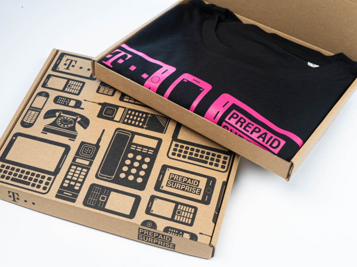
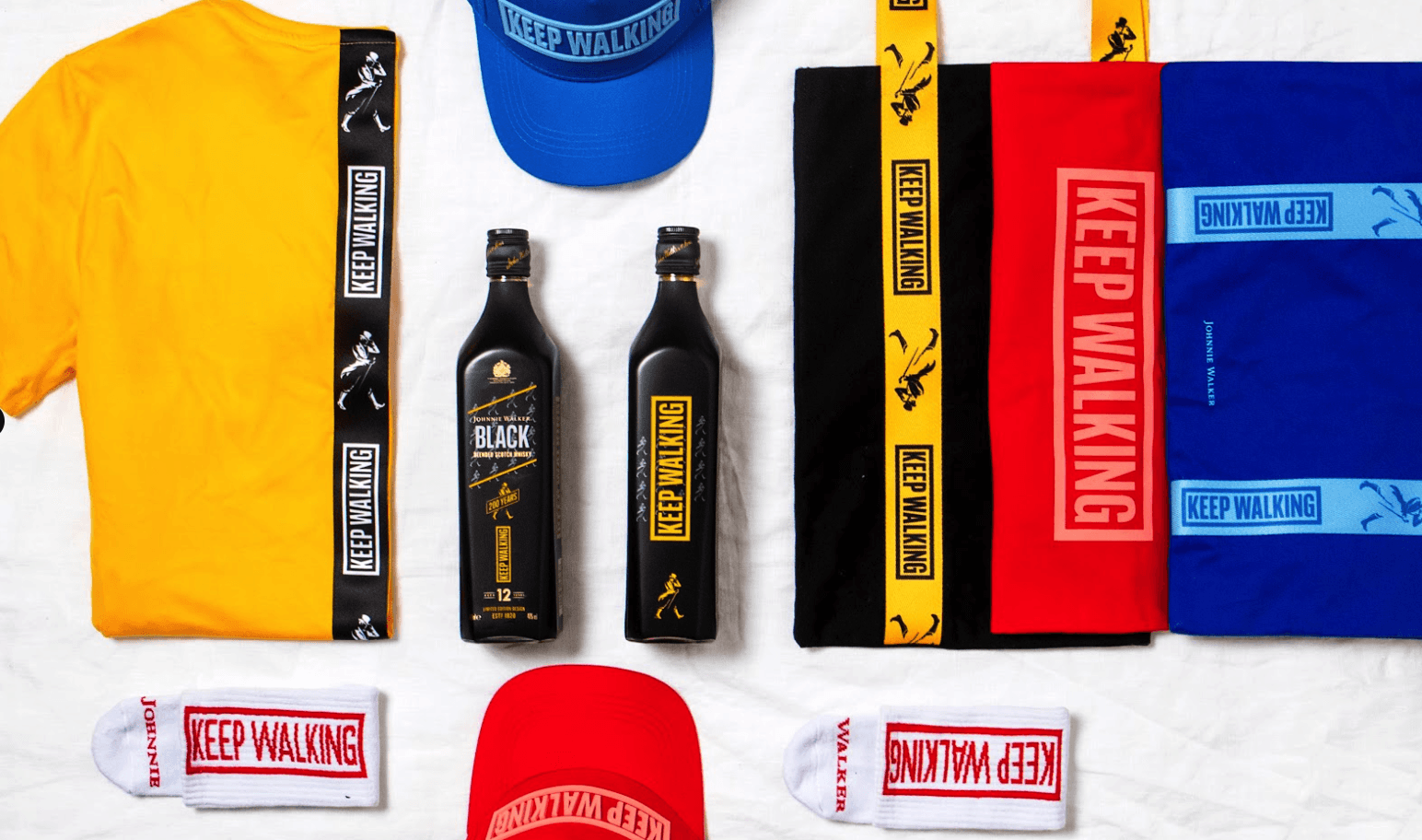
- Dark apparel decoration. A reversed logo lets a wordmark print white and bright on black or navy tees and hoodies, where the primary dark logo would disappear.
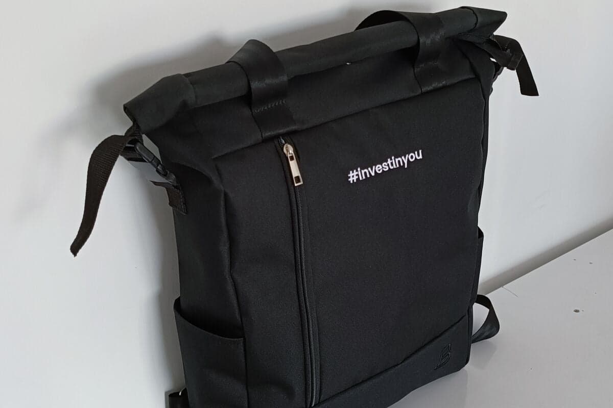
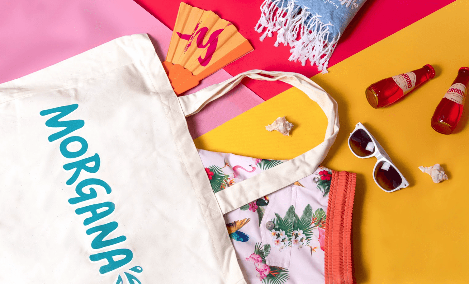
- Colored drinkware and bags. On a deep-toned bottle, tote, or cap, the reversed version keeps the brand readable against a rich background instead of blending in.
- Photo and pattern backgrounds. When a logo sits over a busy image or a colored panel, the reversed white treatment holds contrast and stays legible across the design.
A reversed logo is a light or white version of a logo, built to read clearly against a dark or colored background.
5 tips to elevate your Reversed logo strategy
| Tip | Steps |
|---|---|
| Supply both versions | Send your primary and reversed logo files together so the printer picks the right one per product. |
| Test the real background | Check the reversed mark against the actual garment or product color, not just a screen preview. |
| Thicken fine details | Slightly bolden thin lines and small text in the reversed file so they survive on dark surfaces. |
| Confirm the underbase | For white on dark screen printing, ask about a white underbase to keep the color opaque. |
| Keep it vector | Provide a clean vector file so the reversed logo scales without soft or blurry edges. |
Key Terminologies
Frequently Asked Questions
What is the difference between a reversed logo and a regular logo?
A regular or primary logo is built for light backgrounds, usually with dark artwork. A reversed logo is the light version, built for dark or colored backgrounds so the mark keeps its contrast.
Is a reversed logo always white?
Usually, but not always. White is the most common reversed treatment, though some brands use a light tint or keep a colored icon while only the text flips to a lighter shade for legibility.
Do I need a separate file for a reversed logo?
Yes. A dedicated reversed file avoids on-the-fly color inversion and lets a designer adjust detail weight, so the mark reads correctly on the intended dark background.
Why does my white logo look thin on a dark shirt?
Light ink on dark can appear to shrink at the edges. Printers correct this with a white underbase and small choke or spread tweaks, which is easier when you supply a prepared reversed file.
When should I use a reversed logo on merch?
Use it whenever the product background is dark or heavily colored, such as black tees, navy caps, colored bottles, or a logo placed over a photo or pattern.