Definition
Logo placement is where your logo sits on a product and how large it appears. It is one of the biggest factors in whether branded merch looks premium or cheap, because the same artwork can feel sharp on a left chest and clumsy stretched across a full back. Good placement follows the positions people already expect for each item and stays inside the print area the decoration method allows.
Definition
Logo placement describes exactly where a logo is applied on a garment, bag or bottle, along with its size and alignment. Every product has conventional spots that wearers read as normal, and moving away from them draws attention for the wrong reason. For example, the default on a polo is a left chest logo roughly 7 to 9 cm wide. Center that same logo on the chest and it stops looking like a uniform and starts looking like a costume. Placement is a design decision, not an afterthought at the end of production.
How logo placement works
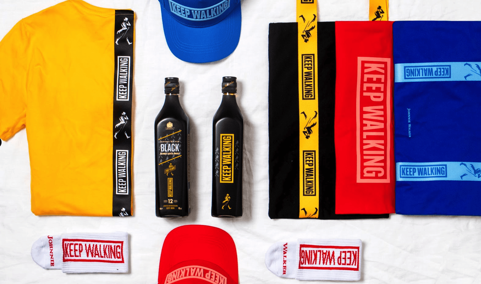
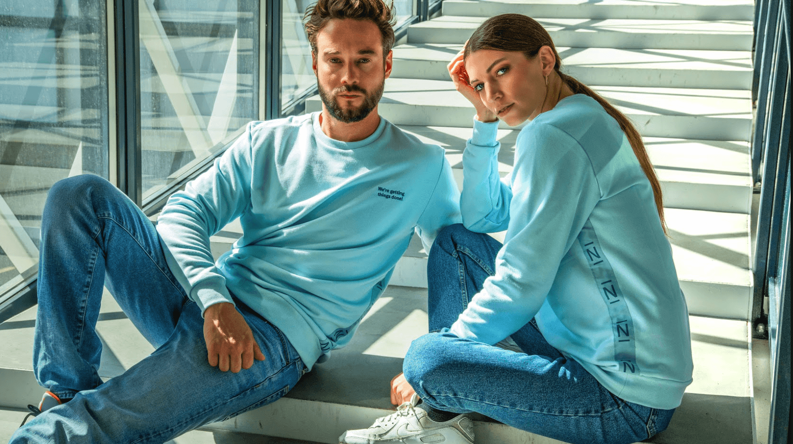
Each product type has standard positions. On apparel that means left chest, right chest, full front, full back, upper back below the collar, sleeve and nape. On bags it means the front panel, side pocket or base. On drinkware it means a wrap or a single face. These conventions exist because they flatter the shape of the item and sit where the eye lands first. Choosing a position is the starting point, and the size follows from it. A left chest logo usually lands around 7 to 9 cm wide, a full front around 25 to 30 cm.
The decoration method sets hard limits on what a position can hold. Embroidery has a maximum stitch area and loses fine detail below a certain size, so a small crest works but tiny body text does not. Screen printing needs each color separated, which is why a Pantone reference matters for consistency. Digital and direct-to-garment printing handle gradients and photographic logos that embroidery cannot. Laser engraving suits metal bottles and pens. The safe print area, the seams nearby and the curve of the surface all decide whether a placement is even possible.
File prep is where placement becomes production-ready. Vector artwork keeps edges crisp at any size, and a print-ready PDF or vector file avoids the blur you get from a low-resolution image. Placement also has to respect bleed and safe margins so nothing important sits too close to a seam or edge. Getting the coordinates, size and file right before the run starts is what keeps a reorder looking identical to the first batch.
Logo placement in branded merch
- Building a recognizable kit. Keep the same placement across a product family so a tee, hoodie and cap read as one set. A consistent left chest logo makes a mixed order feel like a considered uniform rather than a pile of separate items.
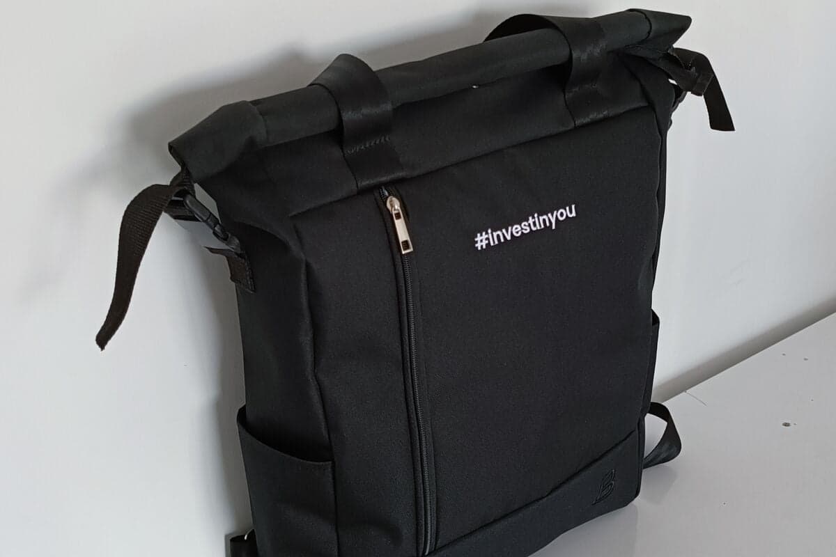
- Signaling the tier of a gift. A small, tonal nape logo feels understated and premium for client gifting, while a bold full front suits event giveaways meant to be seen from across a room. The position does a lot of the talking.
- Fitting the product and the wearer. Choose placements people will actually wear. A subtle chest or sleeve mark gets worn far more often than a large back print, so the merch keeps circulating and doing its job.
Logo placement is the position, size and orientation of a logo on a product, chosen to suit the item, the decoration method and the brand.
5 tips to elevate your Logo placement strategy
| Tip | Steps |
|---|---|
| Follow the standard spots | Use the conventional position for each product unless you have a clear reason to move it, since wearers expect it. |
| Size the logo to the area | Match the logo width to the item, roughly 7 to 9 cm for a left chest and 25 to 30 cm for a full front. |
| Match method to position | Confirm the decoration method suits the spot, since embroidery and print behave very differently on curves and seams. |
| Supply vector artwork | Send a vector or print-ready file so the logo stays sharp at any placement and size. |
| Approve a mockup first | Sign off a placement mockup before production so the position is locked for every reorder. |
Key Terminologies
Frequently Asked Questions
Where should a logo go on a t-shirt?
The most common placements are the left chest and the full front. A left chest logo suits everyday and corporate wear, while a full front works for events and bolder branding.
What size should a chest logo be?
A left chest logo is usually around 7 to 9 cm wide. This keeps it visible without dominating the garment, and it matches what people expect from a branded polo or tee.
Does the decoration method affect placement?
Yes. Embroidery, screen printing and digital printing each have different size limits and behave differently near seams and curves, so the position and method should be chosen together.
Can I put a logo on a sleeve or nape?
Yes. Sleeve and nape placements are popular for a subtle, premium look. They work best with small, simple logos, often in a single color.
What file do I need for good placement?
A vector file or a print-ready PDF is best. It keeps the logo sharp at any size and lets the producer position it accurately for every reorder.