


Definition
A monochrome logo is a version of your logo rendered in a single color, usually solid black or solid white, with no gradients, tints or secondary colors. It is the version you reach for when a decoration method can only lay down one ink or one thread. Because it carries the full recognition of your brand mark without relying on color, it stays sharp on apparel, packaging and engraved surfaces alike.
Definition
A monochrome logo strips a brand mark down to one flat color so it reproduces cleanly through any single-color process. Most brand kits ship at least two: an all-black version for light backgrounds and an all-white or reversed version for dark ones. For example, a coffee brand with a green-and-brown logo will supply a solid black stamp for a kraft cup sleeve and a solid white print for a dark roast bag, both drawn from the same monochrome artwork.
How a monochrome logo works
A monochrome logo works by removing every color value and converting the artwork into a single solid shape or line drawing. Designers rebuild the mark so detail is carried by shape and negative space rather than color contrast. Thin outlines, drop shadows and color-dependent elements get simplified or dropped, because they vanish the moment the file goes to one ink.
It usually lives as a vector logo so it can scale from a pen clip to a building sign without losing its edges. Many teams keep a full set: 100% black, 100% white, and sometimes a single spot color that matches the brand's Pantone reference. Keeping these as separate, locked files stops someone from rebuilding a one-color version badly under deadline.
The trade-off is nuance. A monochrome logo cannot show the depth of a gradient or the interplay of brand colors, so marks that lean on color to tell their parts apart can look flat in one ink. Good monochrome artwork solves this at the design stage, not on the production floor. It also has to survive shrinking, since methods like embroidery and laser engraving reproduce only solid shapes.
Monochrome logo in branded merch
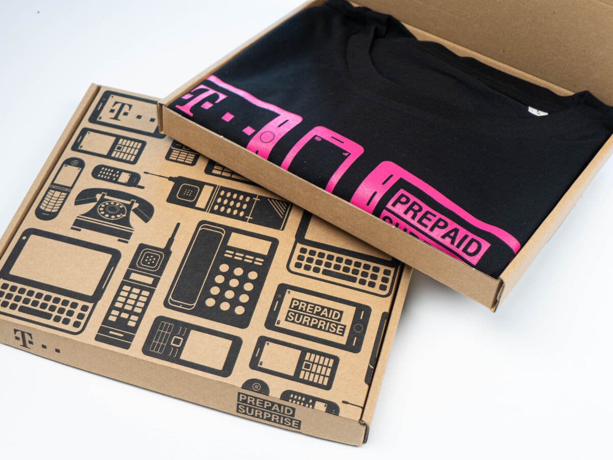
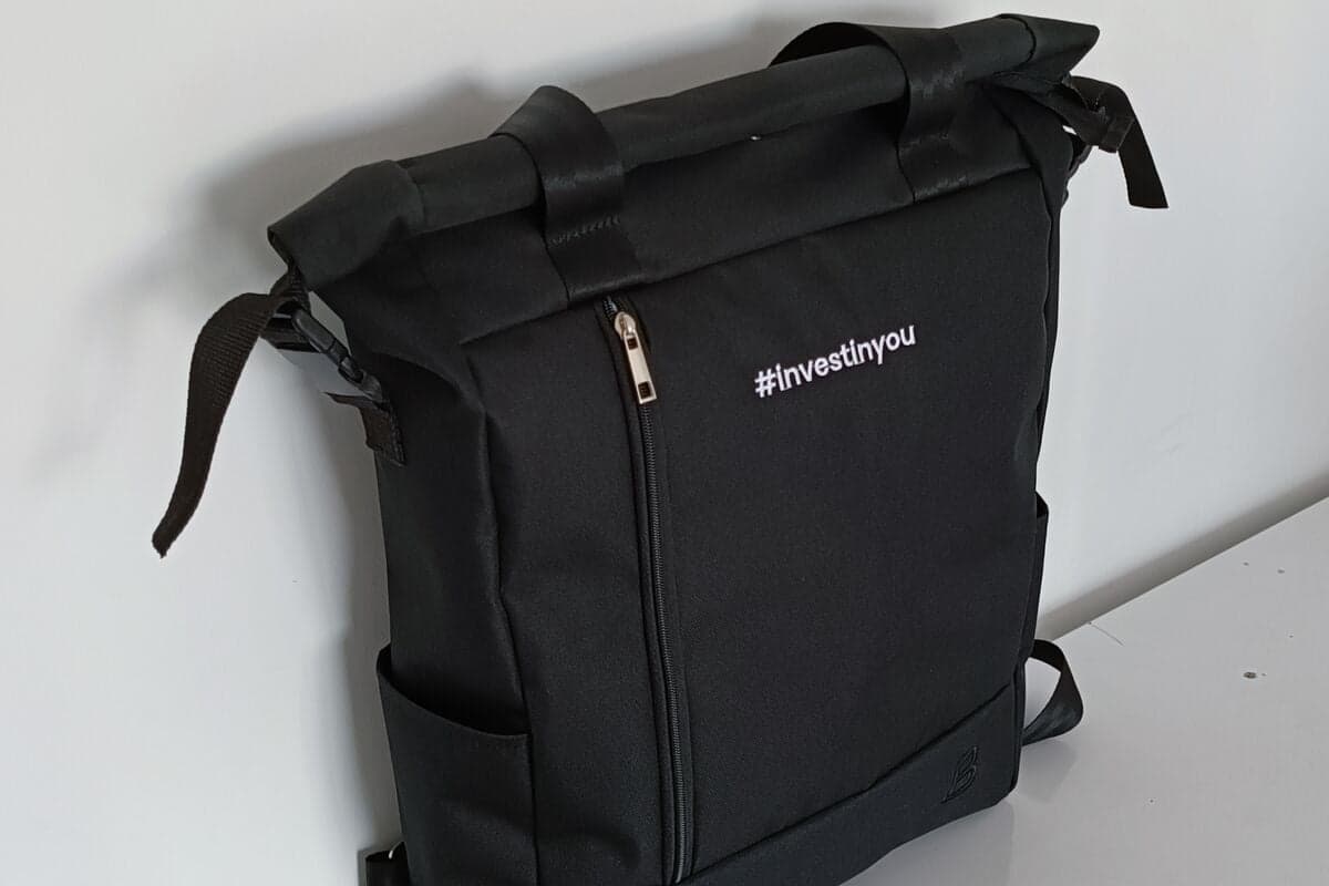
- Single-color decoration. Screen printing with one ink, embroidery in one thread color, laser engraving and debossing all need a clean single-color mark. A monochrome logo is what these methods actually reproduce.
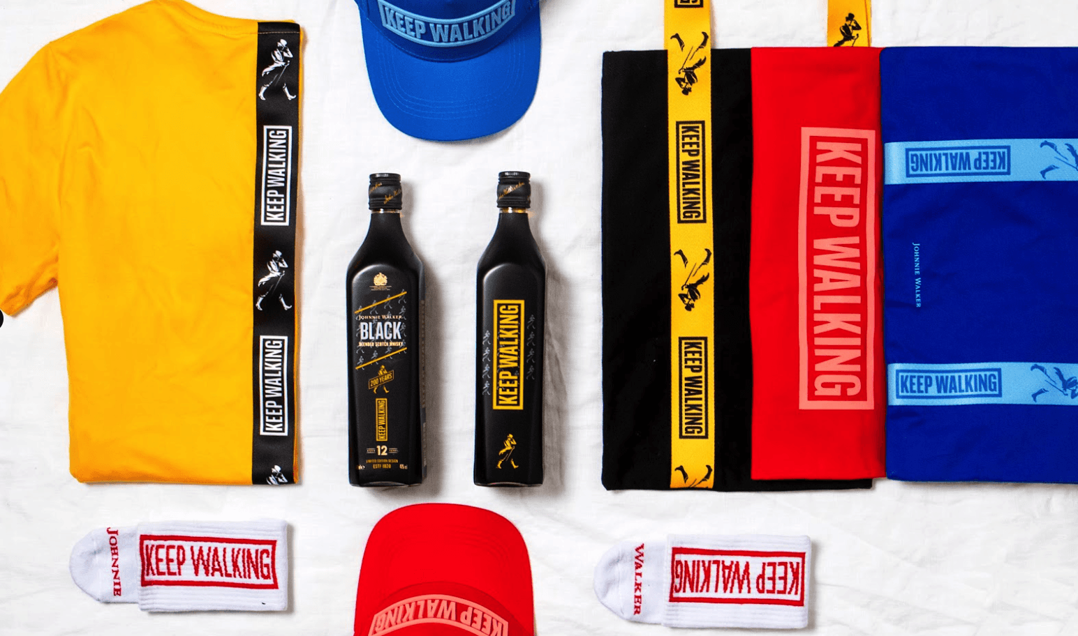
- Legibility on any background. A black version sits on light garments and pale packaging, while a white or reversed version reads clearly on navy hoodies, black bottles and dark boxes.
- Cost and speed. One ink means one screen, fewer setup fees and faster turnaround, which keeps large runs and rush orders predictable without losing brand consistency.
A monochrome logo is a single-color version of a brand mark, built to stay legible and on-brand wherever only one color can be applied.
5 tips to elevate your Monochrome logo strategy
| Tip | Steps |
|---|---|
| Supply both versions | Always send an all-black and an all-white file so production can match any garment or product color. |
| Keep it vector | Provide the mark as vector artwork so it stays crisp at both a lapel pin and a banner size. |
| Test at small sizes | Shrink the logo to its smallest planned use and check that fine detail survives in one color. |
| Define the spot color | If you want a colored single ink, specify the exact Pantone so every method matches. |
| Lock the files | Store approved monochrome files in your brand kit so no one rebuilds a rushed one-color version. |
Key Terminologies
Frequently Asked Questions
What is the difference between a monochrome and a grayscale logo?
A monochrome logo uses a single flat color with no shading. A grayscale logo uses multiple shades of gray to suggest depth, which needs more ink coverage and does not suit strict one-color methods.
Why do I need a monochrome logo?
Many decoration methods can only apply one color, such as embroidery, engraving and single-ink screen printing. A monochrome logo makes sure your brand mark reproduces cleanly through all of them.
Should a monochrome logo be black or white?
Supply both. Use the black version on light surfaces and the white or reversed version on dark ones, so the logo stays legible whatever the product color.
Can any logo be made monochrome?
Most can, but marks that depend on color to separate their elements need careful redesign. A good monochrome version uses shape and negative space instead of color contrast.
What file format is best for a monochrome logo?
A vector format like SVG, EPS or PDF is best, because it scales without blurring and gives production a clean single-color path to work from.