
Definition
Brand consistency is the repeated, accurate use of the same identity across every touchpoint: logo, colors, typography, imagery and tone. On a website it is mostly a design system problem. On physical merch it is a production problem, because every fabric, ink and supplier introduces a chance to drift. The companies that get it right treat merch as part of the brand.
Definition
Brand consistency means a customer can recognize you without reading your name. Same blue. Same logo proportions. Same voice. A practical example: a company with Pantone 2935 C in its guidelines orders hoodies from one supplier and caps from another. The hoodie print comes back a slightly purple blue, the cap embroidery a slightly green blue. Neither is wrong on its own. Side by side on a photo, the brand looks careless. That gap is what brand consistency is designed to close.
Why brand consistency matters
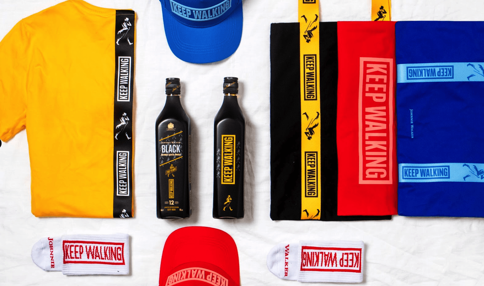
Recognition is built through repetition. Every time someone sees the same mark in the same color, the memory gets a little stronger. Break the pattern and you reset part of that work. Merch is unusually powerful here because it lives in the physical world for years, gets worn in public, and gets photographed. A branded jacket that looks slightly off is a slightly off version of your brand walking around a city.
Inconsistency also costs money quietly. Teams reorder because the color came back wrong. Marketing reshoots content because the sample does not match the campaign. Local offices commission their own designs because they cannot find approved files, and now you are paying for three versions of the same t-shirt. None of this shows up as a line item, which is why it survives for years.
There is a trade-off worth naming. Total rigidity kills relevance. A Pantone match that works on a white cotton tee will not reproduce identically on a dark recycled fleece or an anodized aluminium bottle, and forcing it produces a worse result than adapting intelligently. Good brand consistency defines what must never move, usually the logo geometry and the core color intent, and gives clear rules for what can flex, such as one-color versions, monochrome logo treatments and alternate lockups for small print areas.
Brand consistency in branded merch
- Locking color across suppliers and materials. Specify Pantone references rather than screenshots or hex codes, and confirm how those references translate to embroidery thread, screen printing ink and dyed fabric. This is where most drift begins.
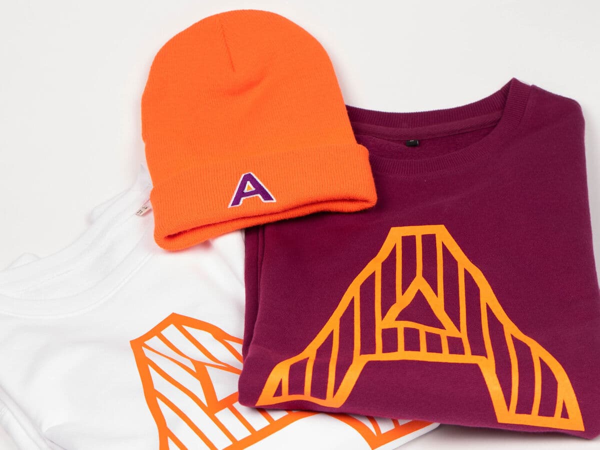
- Standardizing logo placement and size. Fix the position, scale and clear space for each product type so a chest print on a tee, a cap front and a bottle wrap all read as one family rather than three separate attempts.
- Giving every team the same approved assets. Regional offices, event managers and HR all order merch. If they pull from a single source of approved vector files and product presets, consistency happens by default instead of by review.
Brand consistency is the accurate, repeated use of the same brand identity, colors, logo, typography and tone across every channel and every physical product a company produces.
5 tips to elevate your Brand consistency strategy
| Tip | Steps |
|---|---|
| Define color by Pantone | Give suppliers exact Pantone references per material, not hex or RGB values pulled from a slide. |
| Approve a physical reference | Keep a signed-off sample of each core product as the standard for every future reorder. |
| Write merch into your guidelines | Add a merch section covering minimum logo size, clear space and one-color versions for small areas. |
| Centralize the files | Store approved vector artwork in one place so nobody recreates the logo from a screenshot. |
| Audit once a year | Photograph everything currently in circulation side by side and remove what no longer matches. |
Key Terminologies
Frequently Asked Questions
Why is brand consistency important for merch?
Merch is worn and used in public for years, so inconsistent color or logo placement puts a slightly wrong version of your brand into the world permanently. Consistent merch reinforces recognition instead of diluting it.
How do you keep brand colors consistent across products?
Specify Pantone references per material rather than hex codes, approve a physical sample before full production, and keep that sample as the reference for every reorder. Colors read differently on cotton, polyester and metal, so confirm each one.
What causes brand inconsistency in merch orders?
The usual causes are multiple suppliers with no shared color reference, teams recreating logos from screenshots, and no rules for logo size or placement on small products. Decentralized ordering without a shared asset library accelerates all three.
Should brand guidelines cover physical products?
Yes. Most guidelines stop at digital and print, which leaves suppliers to guess on embroidery, small-area prints and dark backgrounds. A short merch section covering minimum sizes, clear space and one-color versions prevents most problems.
Can you be too strict about brand consistency?
Yes. A color that reproduces perfectly on white cotton may be unachievable on dark recycled fabric. Define what is fixed, usually logo geometry and color intent, and give clear approved alternatives for everything else.