
Definition
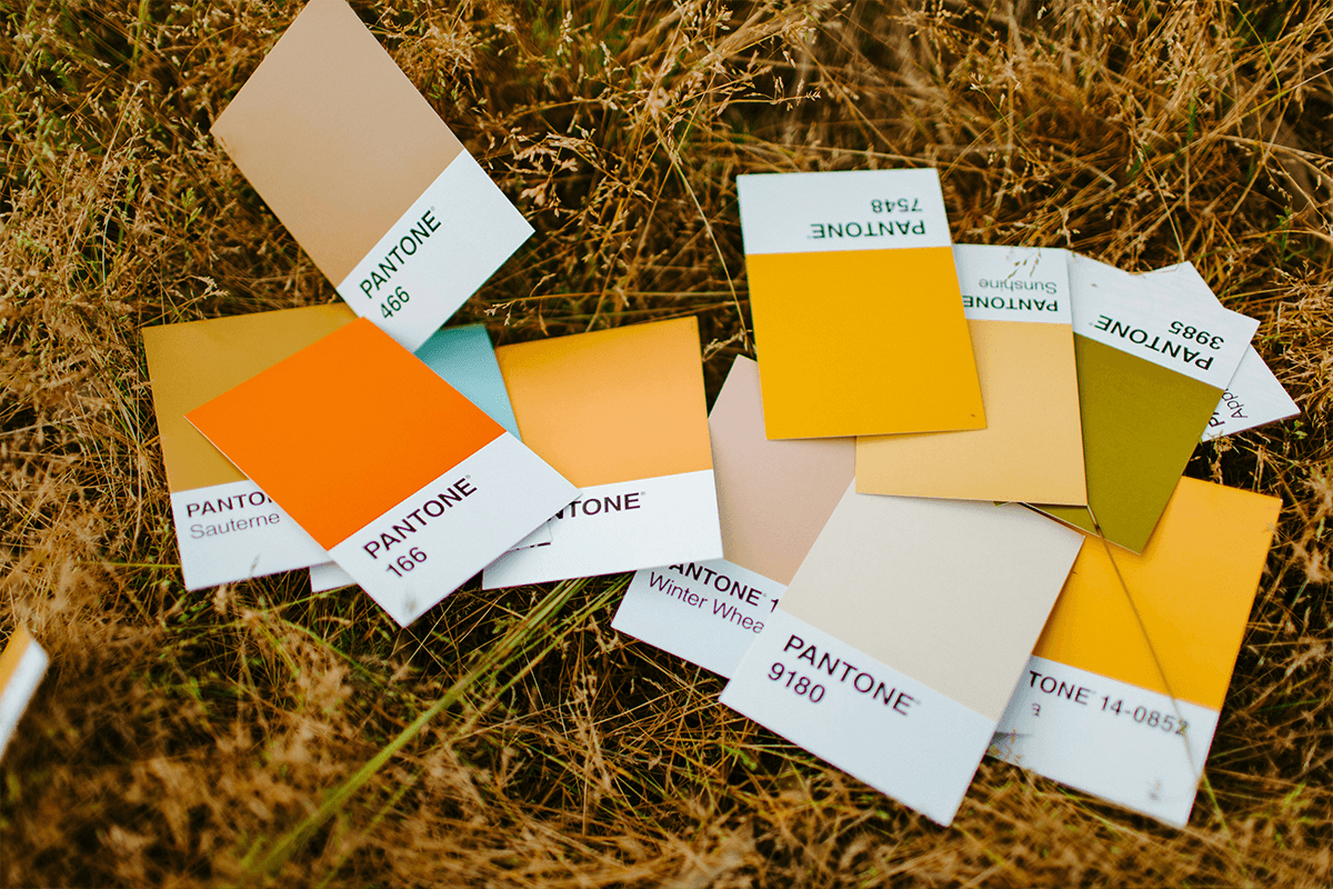
A Pantone color chart is a standardized set of printed color swatches, each tied to a unique number, that lets everyone reproduce the exact same color on any material. It is the reference both you and your printer point to when a brand color has to look identical on a hoodie, a notebook, and a tote.
Definition
A Pantone color chart shows physical swatches from the Pantone Matching System (PMS), each with a code like 186 C or 2945 C. Because the swatches are printed with fixed ink recipes, two people in two countries can both order "Pantone 186 C" and get the same red. For example, a coffee brand can spec PMS 1815 C for its logo, and every supplier mixes that brown to match the chip, not their screen.
How a Pantone color chart works
Each Pantone color is a fixed recipe of base inks mixed to a precise ratio. The chart prints that recipe on coated, uncoated, and sometimes textured stock, because the same ink looks different on glossy paper than on raw cotton. The suffix tells you the surface: C for coated, U for uncoated. That is why a color can shift between a printed flyer and an embroidered cap.
Pantone is a spot-color system, so it sits apart from process printing. Instead of building a color from four overlapping screens, you mix one solid ink to the target. This gives sharper, more consistent results for logos, especially with bright or specialty shades that four-color printing struggles to hit.
The trade-off is reach. Not every production method can print spot inks. Screen printing and many merch decorations match Pantone well, but digital and full-color methods often convert the Pantone reference to their own gamut. Knowing where your color will live tells you how literally the chart can be followed.
Pantone color chart in branded merch
- Lock your brand color once. Pick the Pantone reference for your primary brand color and put it in your brand guide so every product order starts from the same chip.
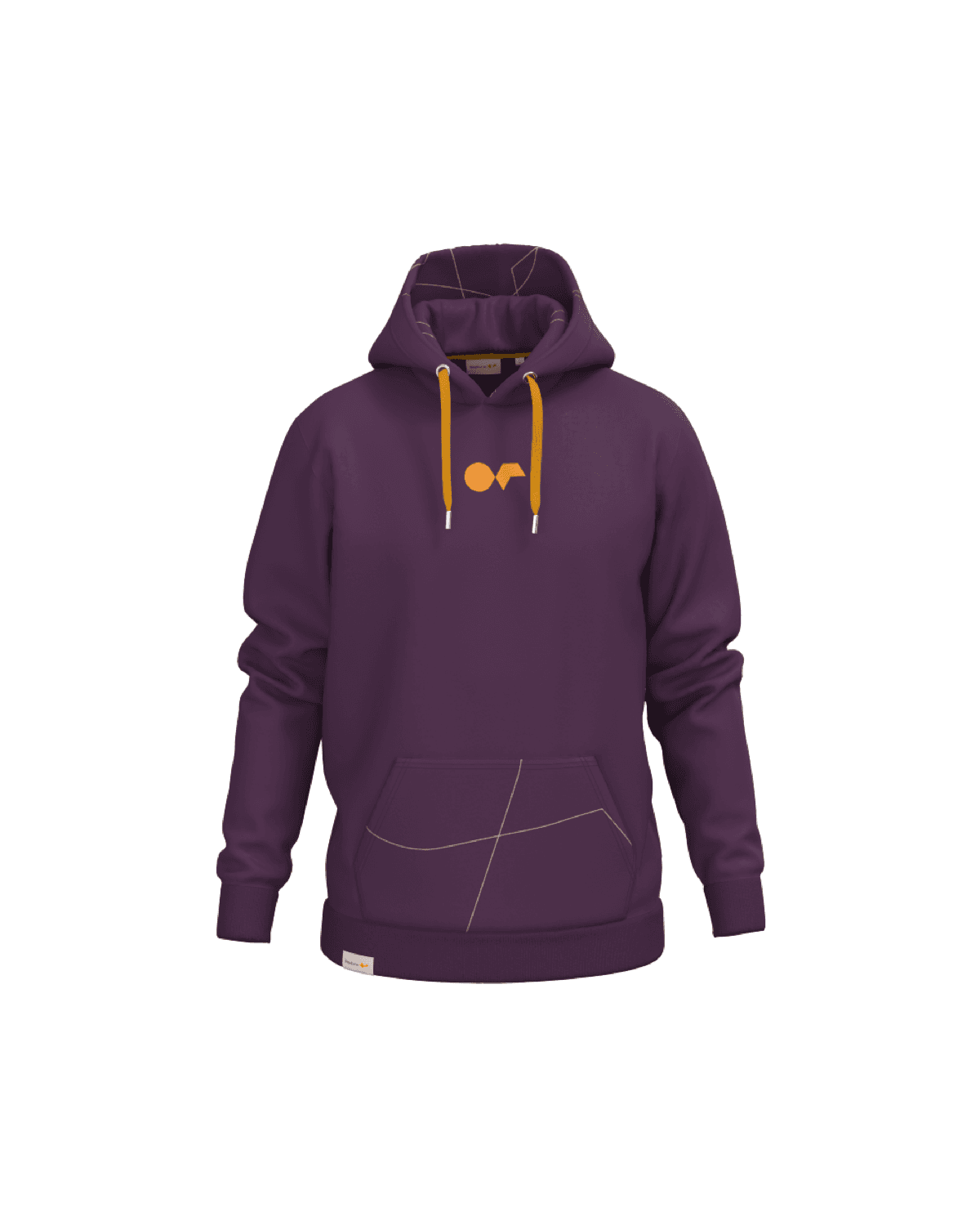
- Match across materials. Use coated and uncoated values so the color reads right on both a glossy mug and a soft cotton tee.
- Brief suppliers without guesswork. Hand a production partner a Pantone code instead of a screenshot, and the approval cycle gets shorter and more reliable.
A Pantone color chart is a numbered swatch system that defines exact, repeatable colors across print and physical products.
5 tips to elevate your Pantone color chart strategy
| Tip | Steps |
|---|---|
| Spec by code | Always share the Pantone number, never a JPG or "our blue" |
| Note the surface | Give C and U values so dark and light fabrics both match |
| Use a current book | Pantone chips fade, so replace your guide every few years |
| Check under daylight | Judge swatches in neutral light, not under office bulbs |
| Confirm the method | Ask whether your decoration prints spot ink or converts it |
Key Terminologies
Frequently Asked Questions
What does the C or U after a Pantone number mean?
C means the color is shown on coated (glossy) stock and U means uncoated (matte) stock. The same ink looks different on each, so the suffix tells you which surface the swatch represents.
Is a Pantone color chart the same as CMYK?
No. A Pantone chart uses pre-mixed spot inks, while CMYK builds color from four process inks. Many Pantone colors can be approximated in CMYK, but the match is not always exact.
Why do I need a physical Pantone chart if I have the number?
Screens cannot show ink color accurately. A printed chip is the only reliable way to judge how the final color will look on a real product.
Can every merch product match a Pantone color?
Most decoration methods can match Pantone closely, but some full-color or digital methods convert it to their own range. Always confirm with your production partner.
How often should I replace my Pantone guide?
Pantone recommends replacing chips every one to two years because ink fades with light and handling, which can drift your reference over time.